You are currently browsing the tag archive for the ‘Book Covers’ tag.
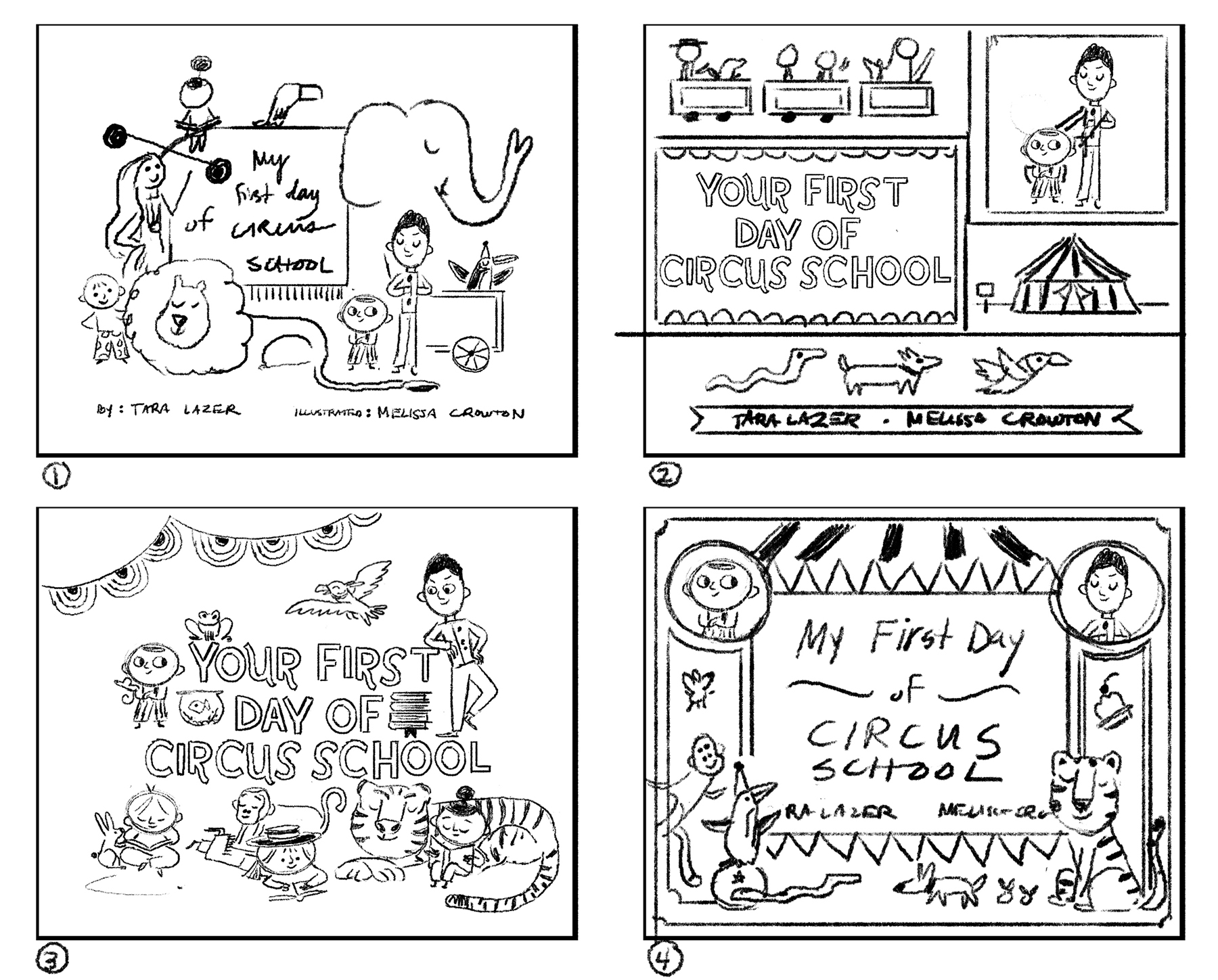
A few weeks ago, I teased the cover to my upcoming book YOUR FIRST DAY OF CIRCUS SCHOOL on Twitter. You may have seen some garbled gobbledygook like this:

You can see a little hint of what’s to come in the lower right corner…
Or you can see the entire thing by following the cover evolution below…
 The illustrator is Melissa Crowton, winner of SCBWI’s 2017 Winter NYC Conference portfolio showcase. Yeah, I am one lucky ducky to be paired with Melissa’s whimsical art.
She’s the star of this cover reveal, so let’s ask her some questions.
Melissa, what was your approach to the cover design for YOUR FIRST DAY OF CIRCUS SCHOOL?
The cover for this book was such a delight to work on. Covers in general are always a challenge—a lot of questions go through my mind.
- What type of mood do I want the cover to convey?
- Should it tell a story?
- Should it be simple, or more complex?
Because this book features a circus school, I knew that I wanted the cover to reference vintage circus memorabilia in some way—a nod to the past, but with a modern update.
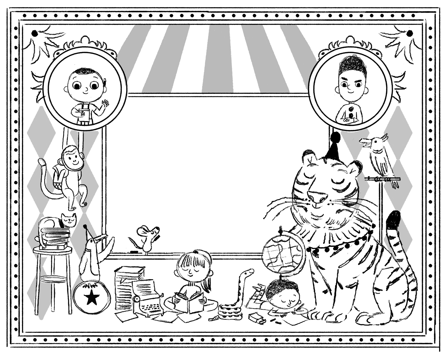
I love collecting images for any project, and luckily for this book there was a gold mine of photos and poster designs available in books and online. The first sketches I worked on for the book were more simple in nature—a cast of characters against a backdrop of the stripes of the tent.


There are so many fun children and adults who show up in the book, and the publisher and I thought it might be fun to have a group on the cover, almost like a school photo. But the more we worked on it, the more it didn’t quite fit. So I went back to the drawing table and I decided to take a more decorative approach.

One thing I noticed in my research was a consistent use of graphic patterns and simple shapes. I had saved some images of old poster designs that used borders and shapes to highlight parts of the circus, so I thought that using a device like that show off the main characters, while also alluding to the busy school setting might be a good solution. I was also able to squeeze in a few animals friends on the cover as well which is always fun.
Once the publisher approved of my second attempt, everything was pretty easy at that point—I arranged the elements around the central focus, the blackboard, and passed my artwork off to the folks at Tundra after I was finished for them to add the title.

Although covers generally go through a lot of back and forth, I am so happy with where it ended up. I wanted the end result to hint at the exciting nature of the story inside, so hopefully it does just that!
How did you decide upon the color palette?
I looooove color, so choosing to make a book with a limited palette was a challenge, but also really fun! I didn’t realize how much I would love trying out different combinations.
I knew I wanted the interior to use a lot of black and white elements, so that was easy to nail down. As for the other colors, that was a bit more difficult, especially considering how many different animals and people were going to be in this book. I had originally chosen a yellow and blue color, but we decided to add pink into the mix to round it out—basically the primary colors but with a twist. I love that the colors play well off of each other but have their own personality, just like the characters in this book.
Did you go to the circus as a kid? What was your favorite part of the circus?
I went to the circus once as a kid with my mother and three sisters. I remember being really excited to see the performances, but my favorite part was actually the costumes. I loved that everyone looked different, but at the same time they were all part of a big family. There were a lot of patterns and colors in interesting combinations which is always something I have tried to incorporate into my own illustration work. I still love looking at old images of the circus for inspiration, there is a lot of great design that was used to promote the circus during those early years.
Melissa, you did a stupendous job on the cover! Thanks for showing us your process to get there!
YOUR FIRST DAY OF CIRCUS SCHOOL will be released by Tundra Books on June 4, 2019.
You can pre-order now…online or via your local indie…and if you do, leave a comment telling me so.
Everyone who pre-orders will be entered to win a PRIZE PACK of circus school goodies, including a signed F&G, poster, SKYPE call/visit, and whatever other good stuff I can stuff in the package.
Thank you, Melissa and Tundra Books!
Melissa Crowton is an illustrator and designer who has been recognized by the Society of Illustrators, American Illustration, Creative Quarterly, and the Society of Children’s Book Writers and Illustrators as the Portfolio Showcase winner at their Winter 2017 Conference. She earned her BFA in Illustration at BYU in 2012 and an MFA in the Illustration Practice Program at Maryland Institute College of Art in Baltimore in 2016. Melissa originally hails from Utah, but she now lives in the East Bay of Northern California. Visit her at melissacrowton.com and follow her on Instagram @mcrowton.
Designing a picture book cover is like housetraining a puppy: it requires lots of patience, there are papers spread all over the house, and it’ll inevitably lead to fits of howling in the middle of the night.

But if you can sniff out the good ideas and clean up your happy accidents, you’ll hopefully wind up with something you’re proud to cuddle up with on the couch.
When I wrangle my picture book covers, I try to explore as many different ideas as possible. I start by sketching a few pages crazy loose brainstormy concepts, and then distill those into half a dozen thumbnail sketches.
I draw my thumbnail sketches at about 1.5″ tall. It forces me to work quickly, make big, bold shapes, and to _not_ get fussy with details. I think it’s best to work in b/w at this point; we can save the color decisions for later.
Here are the cover sketches I submitted to my editor/art director for CAN I BE YOUR DOG? It’s a story about a dog who writes letters to every house on Butternut street, in search of a home–so I knew I’d want the cover to involve DOG + MAIL.
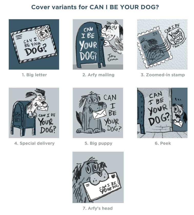
DVD COMMENTARY TRACK ON THE ABOVE IMAGES:
1. Big letter: This would have been a pretty static/boring cover; the puppy is too small! But I kept it here in case it gave us more ideas for another direction to follow.
2. Arfy mailing: I like how this one shows us the dog actually sending a letter. It’s sort of already getting the story started—like a bonus page zero of the book!
3. Zoomed-in stamp: I was trying to show the title in a cancellation stamp, but it’s too hard to read. (I ended up stealing this idea for my ABOUT THE AUTHOR photo on the flap. (With my portrait on a 3RD CLASS STAMP.)
4. Special delivery: I liked this one, especially Arfy’s floppy ears.
5. Big puppy: We ended up using this one as flap art, too.
6. Peek: I liked the timidness of the puppy peeking around the corner; we ended up using a variant of this on the back cover.
7. Arfy’s head: This was everyone’s favorite. The scruffy mutt is prominently featured, and it was nice to work the title into the illustration.
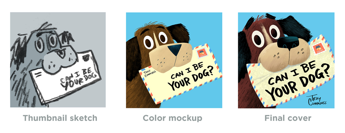
Once we’d agreed on a direction, my art director Liz (who rocks!) was able to take my sketch and improve it like crazy. Liz zoomed in on the image, made the title bolder, suggested to bend the letter, and moved my byline out to the background space. I loved all of her suggestions, and we ended up with a jacket that reads pretty well across the room or as a tiny thumbnail image on the web.
The best part about sketching multiple ideas is that none of that work was wasted. I was able to reuse some of my sketches on the flaps/interiors of the book, or for promotional materials.
Troy Cummings is the author/illustrator of more than 30 books, including CAN I BE YOUR DOG?, THE NOTEBOOK OF DOOM, and LITTLE RED GLIDING HOOD (written by the indefatigable Tara Lazar!) You can follow him on Twitter @troycummings, follow him on Instagram @troxcummings, or follow him to the new ice cream shop that opened next door to his studio. (Shrewd move on their part!)

Troy is giving away a signed copy of CAN I BE YOUR DOG?
Leave one comment below to enter. A winner will be selected next week.
In the midst of her first Storystorm in 2015, Sarah Lynne Reul was picking up her daughter from French lessons (her husband is French with family in France) when she began receiving a slew of text messages from friends checking in to say they were safe. She had no idea what was going on. Turning on the radio, she heard scant details about the terrorist attacks in Paris.
“I walked into the after-school building full of people with family in France, and it seemed nobody else was yet aware of the attacks. I couldn’t decide if it was helpful or harmful for me to tell them about it, since I had so little information on what had happened.”
She recalled how everyone was glued to the TV during September 11, even though the news anchors kept repeating themselves, trying to reach conclusions before the mesmerized, worried audience.
While she was driving home, Sarah could tell that her daughter knew something was going on, even though the radio was off. “She told me she’d make a forcefield to protect everyone we knew, and it made my heart ache. I jotted that down when we got home as the idea of the day. I kept coming back to the concept, and a few weeks later created the first draft.”
The result is THE BREAKING NEWS, her debut picture book as author-illustrator. And today Sarah is revealing the cover with the story behind its evolution.

Thanks for hosting my cover reveal, Tara.
We went through a bunch of different iterations for the cover—my editor, Claire Dorsett, and my art director, Anne Diebel, provided lots of guidance and feedback throughout the process.
I began the process for the cover after I had finished all of the interior art. The original working title had been “THE BAD NEWS”, which felt a bit too negative, and for a while, we were playing with the title “ONE SMALL THING”, so you’ll see those names in some of the early sketches below. We eventually settled on “THE BREAKING NEWS” as a final title, which we all felt works best for the book.
Here are some of my earliest sketches for the cover.

I liked the one that I had circled here—I felt like it showed a problem for the main character to solve, but ultimately it didn’t show a connection to the actual news media, which plays a pretty big role in the book.
So I tried a few options that put the focus on newspapers and/or TV, as well as the reaction of the family.

We ended up going with a variation of the middle option, and then we went back and forth on the framing. Here’s a sample mockup from Anne:

Finally, I worked on softening the expressions and exploring options for the colors and the hand lettered title to find the right combination for the final.

Fascinating glimpse into the process for this book, Sarah, thank you! And having been lucky enough to read it, I can say that it sums up the story beautifully.
THE BREAKING NEWS by Sarah Lynne Reul makes it debut April 10, 2018 from Roaring Brook Press. Mark your calendars, eager readers!
Releasing on January 5, 2016 is Salina Yoon’s 158th book, BE A FRIEND. (Yes, it really is her 158th book. Salina is the most prolific author-illustrator on the planet!)
The delightful cover is being revealed by Bloomsbury exclusively here today!
Isn’t it sweet?

Salina, I know with my books the cover has come at the end of the book-making process…but I recently spoke with Matthew Cordell and his latest book’s cover idea came to him early on. When did you create this cover and what about the story did you want to convey through the images?
The cover was the first thing I designed and illustrated when I conceived of the idea to prepare it for submission. But since then, the cover’s changed a few times, even its title, and only recently was everything finalized. The book itself was completed much earlier.
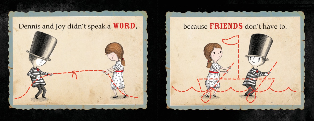
Conveying the story with just one image and one title is so challenging with any book. In BE A FRIEND, it was important to show the two main characters having a deep connection to one another. It’s a unique kind of friendship because one child is silent, and he lives in a world of his own imagination. But here, we see the girl looking straight into his eyes, accepting the gift he dreamed up in his mind. She accepts him, just the way he is, and that’s a strong theme in the book. Like a mother who blows a kiss across a room and the child snatching it up, even gifts of the imagination are felt if the heart is in them.
Could you tell us a little more about the book?
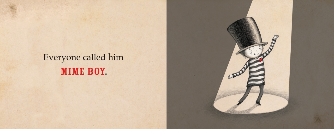
BE A FRIEND is about a boy named Dennis who expresses himself through the silent art of mime, which alienates him from the other kids. No one seems to notice him, except one girl. Her name is Joy. Even without words, they can laugh and play. And most importantly, they can be friends. Joy shows Dennis that he can still be himself while including others—that his world needn’t be solitary.
This book is for any child (or adult) who has ever felt different that made them feel alone, and the importance of reaching out and making connections.
BE A FRIEND is a heartwarming celebration of individuality, imagination, and the power of friendship. (Bloomsbury/January 2016)
Salina is giving away three signed, framed art prints from BE A FRIEND just for visiting her cover reveal today.
Leave a comment below; one comment per person, please. Three random winners will be drawn on May 18th. Good luck!
Thanks to all the children who participated in Ammi-Joan Paquette’s THE TIPTOE GUIDE cover contest! We asked you to draw the cover of what you imagined could be the next book in the series, and we received some very creative entries. Since they were all so good, we randomly selected a winner. So…
Congratulations, Annika, age 9!

Annika wins a signed copy of THE TIPTOE GUIDE TO TRACKING MERMAIDS! And who knows, maybe sometime soon we’ll see a TIPTOE GUIDE TO TRACKING PEGASUSES! (PEGASI? PEGASU? Just what *is* the plural?!)
And here are the runners up…
Grace, age 9!

Katie, age 5! (With my personal favorite, MONSTERS!)

Lili, age 4! (Wow, nice lettering, Lili!)

And Molly, age 9, with a very colorful entry!

Thanks to all the kids who entered! It’s so much fun to see your creativity at work.
I promise to have more cover contests soon, including one for my upcoming book, THE MONSTORE!
This post is just one in a series about the 2008 Rutgers University Council on Children’s Literature One-on-One Mentoring Conference. Click the RUCCL tag above to read them all.
Chad Beckerman is a graduate of the prestigious Rhode Island School of Design. He worked at Scholastic and Greenwillow before taking on the role of Art Director at Abrams BFYR and Amulet Books. Besides designing book jackets, he illustrates YA covers and creates the artwork for novel interiors. In addition to all that, he’s got a wry sense of humor and knows how to work a microphone.

Chad Beckerman, Molly O'Neill, Lisa Cheng, Lisa Ann Sandell
Chad told us he’s unlike an editor. “They like to put their hands in everything,” he quipped. “I just have to make things look nice. And that’s…really nice.”
One of the things he likes to do is check out the competition. “I’m in the bookstores every weekend,” he said. He eyes what’s on the shelves, but he’s keenly aware that “you shouldn’t try to be what other books are being.” His job is to remain as unique as possible. “Look at what is out there, but do something totally original.”
Chad talked about translating novels into cool visuals and how difficult a task it can be to get it right for the audience. He recently worked on a book where a school prankster shoots classmates you-know-where with a watergun so it looks like they peed their pants. “That’s great,” he said, “here’s what we’re gonna do. We’ll put a watergun on the cover squirting yellow liquid!” But there’s some lines you can’t cross. It’s only a watergun, but it’s also a gun. And urine. “They told me we can’t do it, we just can’t. It made me sad, but I got over it.”
Chad is the savvy designer behind Jeff Kinney’s blockbuster novel-in-cartoons, Diary of a Wimpy Kid. “That one was really hard to do, even though it’s really simple.” There’s no color in the book; the interior illustrations are simple black drawings. But the book still needed a color identity if it was to be noticed on the shelves. People often associate a diary with a brown leather cover, but Chad felt that was “too literal” a translation for this book.
The Diary is a journal that the character’s mom gives him, so Chad looked at a lot of different diaries to get a feel for what this book should be. They settled on a typeset font for “DIARY” to suggest it was a bookstore purchase by Mom, but they scribbled “of a Wimpy Kid” in handwriting to demonstrate it was personalized by the main character Greg. Then they placed a ripped piece of paper with a drawing of Greg on the cover, seemingly torn right from the diary. (I personally love the wimpy, slouching pose.) The background is red to make it stand out, but it’s not a solid red—it has a slightly worn, leathery appearance. And each book in this series is color-coded. There’s a green one, a blue one and a do-it-yourself version in orange. “Some people think it’s brown, but it’s not brown, it’s orange,” Chad reminded us. The different colors help kids easily pick out the ones they don’t yet have!
People often ask Chad where he finds illustrators. In this digital age, he loves to browse websites and blogs looking for new talent. But the best way to get to him is by sending a postcard with a web address. It sits on his desk and reminds him to go online.
One point Chad emphasized to the RUCCL mentees is that “if you like what you’re writing about, then you need to go with it.” No matter what it is, he promises to make it jump off the shelves.
To wrap us this series, next I’ll post about the audience questions!
You’ve got less than fifteen seconds to grab a bookstore customer. That’s it. Your cover must lure them to the shelf. The title and design must call to them. Fail this instant judgment test and lose a sale. Yep, they really do judge a book by its cover.
So do kids. My Kindergartener cannot read, but she knows what books she wants. Last week she came home with a list of book fair titles she had selected on her own, solely by the covers. I decided to research the books before deciding whether to buy.
Without exception, every book cover featured a pony or a dog. Yes, she loves both animals. But the one book that she begged for the most? My Chincoteague Pony by Susan Jeffers.
 How could a horse-crazed little girl resist? A black-and-white filly seems to be smiling as waves splash around her. The two-toned pink background and glitter on both the letters and the water seal the deal.
The story inside proves to be just as charming as the cover. Julie works hard on the family farm all year, earning money to buy her own pony at the annual Chincoteague auctions. The cover exudes a certain promise to the reader, and it delivers.
In contrast, another horse-themed picture book attracted my attention, but my daughter passed it by. The brown, muted tones of Twenty Heartbeats by Dennis Haseley reflects this story’s more mature vibe.
 A wealthy man commissions a master artist to paint a portrait of his favorite horse. Years pass without word from the artist and the man grows angry. Yet the artist does not deliver until he feels the painting is the best he can produce. The book’s message is one of hard work, patience and perseverance, but the lesson needed to be explained to my child whereas she immediately grasped Julie’s work ethic in My Chincoteague Pony.
There could be several reasons for this, none having to do with the cover. For instance, the main character in Jeffers’ tale is a young girl from present time, easily relatable. The main characters in Twenty Heartbeats are adult men from ancient China.
In the end, I purchased both books, although I admit, Twenty Heartbeats was more for me than it was for her.
I wonder if publishers design some book covers to appeal more to the adult-gatekeepers than to the direct audience. This would make sense if a book contains mature themes and universal lessons that parents wish to teach their children.
There are some book covers that both my daughter and I agree upon. Here are just a few that we would like to read together. (Please note that Savvy is a middle-grade novel. But what a gorgeous, eye-catching cover.)