You are currently browsing the tag archive for the ‘Cover Reveal’ tag.
by Jen Fier Jasinski
After only three months and six drafts writing SIDEWALK CHALK, I received a critique from a big-name agent that said: “I’m sorry to say that I am drawing a complete blank on how this might be improved.”
I gasped.
I danced.
I queried that sucker.
I got rejected for another three years and fifteen revisions. Ah, publishing.

SIDEWALK CHALK breaks some rules. The most notable being that the manuscript is mostly illustration notes. That early “unimprovable” draft had only thirty-three words of text… and 691 words of art notes! I am an author-only and have taken many writing courses that (rightfully) advise writers to keep art notes spare, only include those that move the plot forward, and always leave room for the illustrator to add to the story.
So, yeah, 691 words of art notes felt like a risk.
But I didn’t cut them. Actually, I ended up adding more. Why? Because so much of my story idea hung in the art. The characters’ actions, not dialogue, tell this story. The setting foreground and background are integral to the plotline. The weather and chalk pile are near-characters that hold the story’s stakes and tension. In short, those heavy art notes served the story. (Importantly, I became assured of this through additional agent critiques, personalized rejections, and Revise & Resubmit (R&R) requests.)
My story was hitting. My text was not.
SIDEWALK CHALK’s premise has a classic, atmospheric tone. I ultimately realized the text needed to match it. R&Rs made this clear as they encouraged me to build the musicality of the text through more onomatopoeia, then later through internal assonance and alliteration.
Eventually, it worked:
After a box of chalk is plunked on the sidewalk, a shy child watches as neighborhood children come together to—Scribble! Scratch! and Scrawl! – transforming the plain path into a vibrant storyscape. Just as the child finds the courage to join them—Plip! Plop! Splat!—a storm sends them running, threatening their new friendship and their creation.
SIDEWALK CHALK celebrates creativity, collaboration and community.

I am thrilled SIDEWALK CHALK landed in capable, caring hands at Gnome Road Publishing! Illustrator Lea Marie Ravotti has created a precious neighborhood of kids and even though I had heavy notes, I am so impressed with how she added her own spin and sweet style to the story! I am extremely pleased with the ultimate result (60 words of text and 743 words of art notes for those curious,) and I hope readers will be, too.
SIDEWALK CHALK is now available for preorder where most books are sold, for a September 23, 2025 release.
Jen is giving away either a 30-minute AMA virtual session or a copy of the book (winner’s choice) to TWO blog readers! Please leave a comment to enter and two winners will be randomly chosen at the end of the month! Good luck!
 Jen Fier Jasinski spent much of her childhood reading books and imagining new worlds. Unwilling to let go of Story Time, she grew up to become a teacher, mother, and author. Now Jen writes stories with elements of humor, heart, and above all, play. She is the author of My Piano (2023), Sidewalk Chalk (2025), My Violin (2026) and Because of You, I’m a Sister (2026). My Piano earned a starred review from School Library Journal.
When she’s not writing, Jen can be found on the sidewalks of Burke, Virginia running or playing with her kids.
by Jen Fier Jasinski
Thanks, Tara, for hosting the cover reveal for MY PIANO, my debut picture book. You’ve been a steady source of insight, support, and comic relief on my writing journey.
These are the pedals, pressed down to the ground,
under the soundboard where bridges are bound
fixed to the frame enclosed in the case
that lies on the legs with wheels at their base,
to pillar and prop my piano.
I don’t play the piano. I don’t even know how to read music. Honestly, I can’t tell you whether a piece is by Beethoven or Chopin.
So how is it my debut picture book explores the workings of a grand piano through the eyes of a young musician as she prepares for and performs her first recital? Fabulous question.
My husband is a pianist, composer, and piano teacher. Our grand piano replaced our couch and is often called our “fifth family member”. It fills our home with music and joy, occupying a full room and many hours.
Despite the time and space the instrument takes up, years passed before I did more than listen. Then one day I had a friendly chat with our piano tuner. She opened our piano and I glanced inside. Whoa! What was all that? I was quickly fascinated by her tools, her skill, and how the parts interconnect and together create resounding music. I wondered to myself, “If I can spend so much time around a piano without ever exploring its parts, maybe others are missing out, too?”

I had read manuscript wishlist after wishlist searching for stories with a STEAM connection. I had also experienced plenty of second-hand anxiety for my husband’s students at their recitals (Hello, social-emotional layer). And my critique group happened to be completing a challenge to write in cumulative structure. I put the three together and just like that (Kidding… 20+ drafts and four versions later,) MY PIANO hit just the right note!
I am thrilled this story found a home with Gnome Road Publishing and I am blown away by the spirit and artistry Anita Bagdi brought to it. Our hope is it will be a musical treat for kids and adults and help at least one child through their first piano recital.
MY PIANO is now available for preorder where most books are sold, for a September 19, 2023 release.

To celebrate her debut cover reveal, Jen is offering a giveaway of one fiction (non-rhyming) picture book critique.
Leave one comment below to enter.
A random winner will be selected next month!
Good luck!
 Jen Fier Jasinski grew up outside of Washington, D.C. and spent most of her childhood exploring creeks and reading books. Jen taught special education for more than ten years, where her favorite part of the school day was always Story Time. She enjoys spending time with her spouse and kids, reading, and playing outside. Jen’s favorite days are when she gets to do all three. Her extra-favorite days include cake.
Connect with Jen at JenFierJasinski.com and on Twitter and Instagram @jenfierjasinski.
We have been showered with gorgeous picture book covers lately and the latest one is truly a gift! It’s RIVKA’S PRESENTS, written by Laurie Wallmark and illustrated by Adelina Lirius.

It’s 1918 on the Lower East Side of New York City, and Rivka is excited to start school. But when her father gets sick with the flu, her mama has to go to work at the shirtwaist factory and Rivka needs to stay home and take care of her little sister. But Rivka figures out a way to learn anyway: she trades chores with the grocer, the tailor, and an elderly neighbor for lessons. As the seasons change, Rivka finds she can count pennies for the iceman and read the labels on jars of preserve. And one day, papa is no longer sick, and Rivka can finally start school! Full kindness and love for your neighbors, here is a story that introduces life on the Lower East side for a Jewish family during the flu pandemic of 1918.
RIVKA’S PRESENTS releases July 11, 2023 from Random House Studio.
 Award-winning author Laurie Wallmark writes picture book biographies of women in STEM (science, technology, engineering, and math) as well as fiction. Her books have earned multiple starred trade reviews, been chosen as Junior Library Guild Selections, and received awards such as Outstanding Science Trade Book, Best STEM Book, Crystal Kite Award, Cook Prize Honor, and Parents’ Choice Gold Medal. Her titles include ADA BYRON LOVELACE AND THE THINKING MACHINE, GRACE HOPPER: QUEEN OF COMPUTER CODE, HEDY LAMARR’S DOUBLE LIFE, NUMBERS IN MOTION, and CODE BREAKER, SPY HUNTER. Laurie has an MFA in Writing from VCFA and frequently presents at schools as well as national professional conferences (NSTA, NCTE, ALA, TLA, etc.). She is a former software engineer and computer science professor. You can find Laurie at lauriewallmark.com and Twitter @lauriewallmark.
Some of you may already be familiar with my crazy cat, Phoebe.

She meowed at my back door one night, I opened the sliders, and she sashayed in, looked around and said, “Isn’t this great?”, just like Damone from Fast Times at Ridgemont High—anywhere you are, that’s the place to be! (Especially if it has a fireplace and tuna.)
So when Maria Gianferarri asked if I’d do a cover reveal for her companion book to BEING A DOG, Phoebe stepped up to ask the questions about BEING A CAT: A TAIL OF CURIOSITY.
(For ease of reading, I’ve translated from Phoebe’s native Feline tongue.)

Maria, I’m curious, where is Cat’s favorite place to nap?
Cat’s favorite place to nap is dog’s bed.

Surely that can’t be the ONLY place to take a snooze?
Atop a radiator, or in a slice of sun.

Ahh, I know all about sun slices.
Anything else Cat wants to impart to the readers?
Yes. Curiosity did NOT kill the cat.
Thanks, Maria! Now without further meow, the BEING A CAT cover by illustrator Pete Oswald!

Sittin’ pretty!
Blog readers, the prolific Maria is giving away a PB critique with this reveal.
Just leave one comment below.
A random winner will be selected at the end of the month.
Good luck!
 Maria Gianferrari wonders and is in awe of the natural world and its inhabitants, domestic and wild cats included. She lives in Massachusetts with her inquisitive scientist husband and Maple the dog, a watcher who’s curious about anything that moves, especially if she can chase it! Curiously, though an unabashed dog lover, this is Maria’s third book featuring cats as main characters, most recently Bobcat Prowling, as well as Officer Katz and Houndini. You can learn more about Maria at her website, MariaGianferrari.com.
 Pete Oswald is a #1 New York Times bestselling illustrator and an Annie Award-nominated animation production designer best known for The Angry Birds Movie film franchise and Oscar® Nominated ParaNorman, in addition to multiple animated studio films. He is also known for his work as a children’s book author and illustrator, and painter. Pete lives in Los Angeles, California with his wife and three sons.
Thank you so much, Tara, for hosting the cover reveal of THE CORGI AND THE QUEEN (January 2023, from Godwin Books/Macmillan).
The Queen is synonymous with the Pembroke Welsh corgi, and I’ve often wondered what sparked the monarch’s life-long devotion to the breed. It was this curiosity that led me to start work on my manuscript.

I’ve been a journalist for more than half of my life and I’ve also worked in documentary production, so I take a “full immersion” approach to research. I eat, breathe and sleep a story until I find its heart!
When I learned about Susan, the corgi puppy that Elizabeth received as an 18th birthday gift, I was utterly enchanted. Susan was the teenage princess’s constant companion, comforting her during the dark days of World War II, and accompanying Elizabeth and Prince Philip in their wedding carriage (and on their honeymoon)! Susan was also by Elizabeth’s side when she became Queen at the age of 25 after her beloved ‘Papa,’ King George VI, died suddenly.

Even though my life could not be more different from Queen Elizabeth’s, I felt very connected with this story. I went through some challenging times in my childhood, and my pets helped me in ways that people often couldn’t.
The more I found out about Elizabeth and Susan’s bond, the more it became apparent that it was a love story, and one that highlights the universal need for connection. Their special friendship resulted in a regal dog dynasty: fourteen generations of royal corgis were directly descended from Susan!
My agent took THE CORGI AND THE QUEEN out on sub in 2020, and I was lucky enough to get an offer from a dream editor who had the perfect vision for the book. When I was shown samples of illustrator Lydia Corry’s work, it took me less than thirty seconds to respond with a resounding “YES”. I adore Lydia’s art, and she has done a truly incredible job with our book. I’m not ashamed to admit that I shed a tear or two when I saw this cover for the first time!
The Queen is celebrating her Platinum Jubilee this year, after a remarkable (and record-breaking) 70 years on the British throne. During the course of Elizabeth’s reign she has met 13 US Presidents, and while the world has changed immensely since she was crowned in 1953, her love of corgis has endured. She was gifted two corgi puppies during the pandemic, and they now keep her company in her apartments at Windsor Castle.
It’s been more than three years since I started work on THE CORGI AND THE QUEEN and I’m still pinching myself. I cannot wait to see this book in kids’ hands, and I hope that Queen Elizabeth herself gets to read it!

What an adorable cover by Lydia Corry! Thanks for sharing it with us, Caroline!
Blog readers, Caroline is giving away a non-rhyming picture book critique (up to 700 words) in celebration.
Leave one comment below and a random winner will be selected at the end of the month.
Good luck!
 Caroline L. Perry is a British children’s book author, journalist and documentary producer currently residing in California. She’s been writing for a living for over twenty years, and she’s passionate about children’s literature. As an entertainment correspondent she has interviewed stars from across the celebrity spectrum, but she’s happiest when tinkering with a kids’ manuscript, whether it be a picture book biography or a whimsical rhyming text. Visit her online at Carolineperryauthor.com and follow her on Twitter @Caro_Perry.
by Rosie J. Pova
I remember vividly the exact moment the title for the book popped into my head.
It was Thanksgiving Day and my family and I, along with some friends, had rented a cabin in the mountains in Colorado.
The turkey was in the oven, the salads and the sides were made, and I was bored. Everyone else had left to go to some hot springs and soak up, but I had stayed at the cabin to cook. On top of that, I had a cold and was quite miserable to go anywhere, anyway.
Luckily, Jack Canfield had a 2-hour pre-recorded webinar coming up for which I had registered. He was being interviewed, talking about his journey, his ups and downs, marketing and other interesting topics for authors.
I had watched that webinar a few times already and was pretty familiar with the content, but never tired of listening to Jack’s amazing journey to such tremendous success with his CHICKEN SOUP FOR THE SOUL series.
So, I was ready to soak up his wisdom once again.
As usual, his talk left me feeling inspired and motivated. I was in the mood to write.
I started brainstorming catchy titles for a story that would be fun to write. I asked myself, what would be a title that stands out, is intriguing, memorable, and fun to say all at the same time?
Suddenly, it came: THE SCHOOL OF FAILURE. I liked it! Then I thought of an interesting opening sentence. I was trying to amuse myself… hoping that I’d create one of those classic, memorable opening lines.
What followed was, The school of failure was located in the middle of nowhere, but it was the center of everything! I was delighted with my progress and continued to write the first draft that day.
That was a great feeling, it cheered me up, making me forget I was under the weather. And even though the starting of my day seemed like a bit of a fail, it was well worth it to have this time to myself and end up with a completely new story. I was grateful—maybe this was a divine plan after all.
Fast forward a few years, many, many revisions later, and the story sold!
Many more revisions after that, my precious little opening sentence ended up being cut, but the title stayed with the addition of a subtitle: A STORY ABOUT SUCCESS.
Now finally, I am pleased to share it with the world, and hoping it finds its own success in the homes and hearts of many readers.
Thank you all for celebrating this book with me.
And now, the reveal…the cover by Monika Filipina…

P.S. I did find a way to sneak that opening sentence in to the book—it’s now included in my Author’s note!
Thank you, Rosie, for sharing this cover with us! And some adorable story characters…


Rosie is also giving away a 30-minute consulting phone call (or Zoom, depending on your location) to chat about any writing or publishing questions you have for her.
Leave one comment below to enter.
A random winner will be selected soon!
Good luck!
 Rosie J. Pova is a marginalized, multi-published, and award-winning children’s author, poet, speaker, and school presenter. She is also a Writing Instructor for the Dallas Independent School District, an instructor with Writing Workshops Dallas, teaching online picture book courses to children’s writers, and Rate Your Story judge.
Her latest picture book, SUNDAY RAIN (Lantana/Lerner, March 2021), was featured in The New York Times and Parents magazine. Her upcoming picture book, THE SCHOOL OF FAILURE: A Story About Success will be released in 2021 in China and in spring of 2022 in the USA from Yeehoo Press. She has three other children’s books in print as well.
Rosie has been featured on TV, radio, podcasts, and print media, and also speaks on women’s and mom’s topics.
Originally from Bulgaria, she now lives in Dallas, TX with her family.
Visit her at RosieJPova.com and follow her on Twitter @RosiePOV.
The times we’ve been living through feel drained of color, don’t they? It’s similar to Pruett’s world in Nancy Viau’s latest picture book, PRUETT AND SOO.
Pruett is from Planet Monochrome, where everything is black, white, and gray, and everyone follows the rules and walks in straight lines. And they never, ever ask or answer questions.
But then Soo arrives from Planet Prismatic. She’s bursting with brilliant colors! She zigs and zags all over the place! When she asks Pruett questions, he finds he wants to reply…and his whole world starts to change.
With a palette that shifts from grayscale to full color, this engaging story reminds us that what you feel defines who you are—and sometimes a friend helps you see that best.
CHANGE THE RULES. CHANGE THE WORLD!
Nancy, can you tell us about PRUETT’s journey to print?
PRUETT AND SOO sold to Two Lions waaaay back in the spring of 2017. After the first round of initial revisions, all was quiet for about a year. Jorge Lacera was brought on board to do the illustrations, and that’s when the story went through countless, but amazing and extremely detailed, revisions—For. The. Next. Three. Years.
Since the whole color palette had to change S L O W L Y from black and white to full color, every spread had to subtly sneak in a teeny bit more color. Jorge did a terrific job with this, and I am grateful for his hard work and that of the entire editorial team at Two Lions. They perfected every bit of crazy punctuation, every line, every unique color for dialogue, and more.
Funny story: After many revisions, no one noticed that in the first line I referred to Pruett as an alien. A very savvy editor noted right before the F&G was finalized that since Pruett is from the planet where the story takes place, he is NOT an alien! Only Soo is. Good catch, right? This is why we value lots of editors looking over our work!
PRUETT AND SOO blasts into our universe on March 22, 2022.
And now for the reveal:

Congratulations, Nancy!
Blog readers, you can win an F&G of PRUETT & SOO. Just leave one comment below to enter.
A random winner will be selected later this month.
Good luck!
 NANCY VIAU is the author of the picture books TODAY IS A BEACH DAY!, FIRST SNOW, STORM SONG, and more. Her middle-grade novels include SOMETHING IS BUGGING SAMANTHA HANSEN, SAMANTHA HANSEN HAS ROCKS IN HER HEAD (updated for 2019), and others. A former teacher and kid-at-heart, Viau loves to visit schools, libraries, and bookstores across the U.S. to present assembly programs and writing workshops. She currently lives in New Jersey and travels around the solar system in her imagination. Connect with Nancy on Twitter or Instagram @NancyViau1 or via her site: NancyViau.com.
by Shannon Stocker
Mega thanks to my mentor and friend, Tara Lazar, for hosting the cover reveal of my upcoming non-fiction picture book, LISTEN: HOW EVEYLN GLENNIE, A DEAF GIRL, CHANGED PERCUSSION (April 12, 2022, from Dial Books).
About three years ago, after listening to an SCBWI speaker talk about the importance of writing what you know and the #OwnVoices movement, I felt moved to write a book about a musician who’d overcome something huge. A musician who’d beaten the odds, defying the expectations of the world around them.
I, myself, am a pianist, a guitarist, and a vocalist. Music has fed my soul since the day I was born. But I also spent two years in a wheelchair due to a chronic illness called Reflex Sympathetic Dystrophy. For seven years, I fought for my life. Countless physicians told me I would not survive, my condition would not improve, I would never have children, and that my husband should put me in permanent care. Countless people gave up on me, insisting I should accept my fate.
But my husband never gave up on me. And, more importantly, I never gave up on me.
Shortly after that conference, I started doing Google searches for potential subjects. The very first person who popped up was Evelyn Glennie. She is the first person to ever have a full-time career as a solo percussionist. She’s won two Grammy Awards, and been knighted by the Queen of England. And she is deaf.
I continued looking for other potential artists, thinking Evelyn would be too big, too famous, too difficult to reach, but her story kept calling me back. It felt like home. So finally, on February 9, 2019, I wrote to her team to ask if she might have an interest in speaking with me about a potential non-fiction picture book. Only two days later, they replied in the affirmative.
Within a month, Evelyn and I had our first Skype. Although she had a translator attend, Evelyn’s lip-reading abilities and speech made communication simple and clear (she lost her hearing as an older child). Not only was she talented, determined, and kind, but she was also one of the most humble people I’ve ever met. Her story poured from my fingers like the most familiar piano concerto, and within two months it was written, revised, and had its first offer for publication.
Shortly after the book sold to Dial, my editor wrote to tell me Devon Holzwarth would be illustrating. It took me all of three seconds to fall in love with Devon’s work, which I often describe as “music on the page.” I contacted Devon, who currently lives in Germany, and she told me that Evelyn was scheduled to play in the “September Special” classical music event close to her home only two days later! I wrote to Evelyn, who provided Devon with tickets and later met her during a break at the concert.
The entire process felt magical.
At this time, LISTEN will also be published by Penguin UK, and I just recently learned that it’s been selected by the Junior Library Guild as a book club pick. I’m immensely proud to have been a part of this book’s creation. I’m grateful to Evelyn for trusting me with her story. I’m grateful to my agent Allison for seeing something in me beyond this story. I’m grateful to Jess, my brilliant editor, for her insights. And I’m grateful to Devon…who gave my words life and emotion beyond anything I could’ve dreamed.

How beautiful, Shannon! I love the movement of the music depicted in florals, streaming from the drum. It’s lovely; congratulations!
LISTEN: HOW EVELYN GLENNIE, A DEAF GIRL, CHANGED PERCUSSION will be published by Dial on April 12, 2022.
Shannon is giving away a non-rhyming picture book critique in celebration. Leave one comment below and a random winner will be selected next week. Good luck!
 Shannon Stocker is an award-winning author and proud word nerd who lives in Louisville, KY, with her husband, Greg, and their children, Cassidy and Tye. Her debut picture book, CAN U SAVE THE DAY (Sleeping Bear Press), released in 2019, her nonfiction PB bio about Evelyn Glennie comes out with Dial (Penguin/Random House) in 2022, and several of Shannon’s nonfiction essays have been published in Chicken Soup for the Soul. Shannon currently serves as SCBWI social co-director for Louisville, a judge for Rate Your Story, and she created the blog series, Pivotal Moments: inHERview, highlighting transitional life stories of female picture book authors. Cool facts: Currently writing her memoir, Shannon is a medical school graduate, a coma survivor, an RSD/CRPS patient and advocate, and a singer/songwriter who once performed two songs, including one original, as part of an opening act for Blake Shelton. Shannon is represented by Allison Remcheck of Stimola Literary Studio.
Visit Shannon at shannonstocker.com, Facebook, or follow her on Twitter @iwriteforkidz and Instagram @iwriteforkidz.
by KT Johnston
Tara, thank you so much for having me on your blog to reveal the cover of my upcoming narrative nonfiction picture book, JUBILEE: The First Therapy Horse and an Olympic Dream! (February 1, 2022, from Capstone).
JUBILEE recounts the true story of Danish dressage competitor Lis Hartel, who was determined not to let polio keep her from riding again. She found that an inexperienced horse named Jubilee was just the partner she needed to develop a new way of riding—all the way to the 1952 Olympics!
I ran across Jubilee and Lis’s stirring story when researching my first book, RAILWAY JACK: The True Story of an Amazing Baboon (Capstone, 2020), which Amazon Editors have labeled “Best Nonfiction for Kids”. Jubilee hit all the notes for me: an animal who’d had a remarkable impact on an everyday person’s life, in a way that left ripples in society today. No widely-known celebrities; no heroic animal feats; just a life that any of us could be living.
Olympic dressage was not open to women in Lis’s day, but she didn’t let that deter her from aiming for the stars. I won’t say too much about the story, but here’s an awesome fact: the back of a horse will get you three feet closer to the stars.
Inspired by the horse who’d lifted her up, Lis pioneered the world’s first therapeutic riding center. Also inspired by Jubilee and Lis, riding as therapy was quickly endorsed by the medical field, and within a decade, centers sprang up around the globe. And there I saw the crowning element of their story, and knew I had to tell it: Jubilee’s ripples in society.
And now, I’m excited to reveal to you the cover of JUBILEE: The First Therapy Horse and an Olympic Dream!
In this tender illustration, artist Anabella Ortiz captured the partnership between Jubilee and Lis nicely. Lis’s hand is loose on the rein because her hands remained weak throughout her life, though gentle Jubilee didn’t need a firm grip regardless. Lis’s outfit and Jubilee’s braided mane and warm-up blanket indicate they’ve just finished in the ring. You can tell it has gone well by the calm look in Jubilee’s eyes, and the happiness and admiration in Lis’s. One of Jubilee’s ears is forward, alert to Lis, as always. Jubilee’s face is contoured nicely and you can visually feel the velvety softness of her muzzle. The twinkles in the title evoke the stars the pair reached for. …And wrapping the scene in ethereal warmth, “the summer sun beam[s] down like a spotlight on a stage.”
You can see a photo of an actual horseshoe Jubilee wore in the pair’s most famous performance at www.ktjohnston.com/Jubilee!
Any day now, JUBILEE: The First Therapy Horse and an Olympic Dream can be preordered through your favorite bookseller and added to your To-Read shelf in Goodreads.

Thanks for showing off your horse and rider, KT!
Blog readers, KT is giving away a copy of her first book, RAILWAY JACK: The True Story of an Amazing Baboon to a lucky commenter.
Leave one comment below.
A random winner will be selected soon.
Good luck!
 KT Johnston writes historical narrative nonfiction about ordinary animals from the dusty past who had an extraordinary impact on a person’s life, and in the process, left a mark on humanity itself. She aims her writing from accelerated younger readers through reluctant older readers, though her stories are for any age because true stories belong to us all. KT earned a degree in biology and conducted wildlife studies before settling into a more stationary corporate career. She and her husband live in Minneapolis and have two grown children. KT hopes to inspire children to be curious about our world and to find greatness in the humblest of its creatures, one true story at a time.
Follow KT on Twitter @KTDidz, Facebook, and Pinterest @ktjohnstonauthor.
You can see more of Anabella’s work at anabellaortiz.com.
by Courtney Pippin-Mathur
First off, thank you to Tara for hosting my cover reveal on her blog!
HAPPY DIWALI is my most personal book, yet it has been a first for me in a lot of ways.
It will be my third picture book, but it is the first one that I wrote with someone else. The story is about a small girl celebrating Diwali with her family and how she overcomes her initial shyness. It was inspired by my daughter Kiran, and her love of family celebrations but her nervousness of large groups of people.
Diwali is the Hindu celebration of good over evil, light over darkness. This book follows how my sister-in-law Sanyukta brings the joys of Diwali to our culturally- and racially-mixed family in the US. Sanyukta has been involved every step, from writing the first draft (on the phone) to revisions, cultural notes, tips on how to draw a sari, or what should be on the endpapers. When we couldn’t meet in person, we would meet on Zoom. It has been an amazing experience to create a book with her! The photo below is our author photo in the book. It is from long ago but is our favorite picture together.

It is the first book in which every character except one (the main character) is an actual member of our family. I emailed or messaged each parent and asked for photos and tried to include every child in the family. Some might resemble the actual child more than others, and I did age down most of them, but it was a lot of fun!
Here you can see my daughter in her favorite lehenga, and how I drew it in the book.

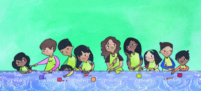
Below is one of my favorite images from the book. In in, the kids are painting diyas. Every year Sanyukta creates a craft, my favorite is painting clay diyas because I can re-use them every year.
It is the first book where the (amazing) editor who acquired the book moved to a new publishing house during the illustration process. Thankfully, the book was left to another wonderful editor. The publisher and art director also moved to new publishing houses, but we were very lucky in that our new editor kept everything chugging along.
It is also the first book I worked on during the pandemic. It took me a few months after Covid first hit the US and everything shut down before I could draw again. Thankfully I had been allocated plenty of time.
Because it had been so long since I have seen many members of the family in the book, I keenly felt the loss of family gatherings as I worked and really look forward to them again soon.
I hope this book can be a thank you from me to my husband’s family for making me feel so welcome in their homes and for always including me in and teaching me about their traditions and culture.
The designer pulled an image from the interior of the book to make the cover.
Here is the color sketch:

And here’s the final cover!

On the front is my sister-in-law Sanyukta and her daughter Priya drawing rangoli. They do that every year to welcome the guests. On the back cover is a group image of the kids eating, which is one of my favorite things to do at Diwali!

Courtney, thank you for sharing this beautiful book and your family traditions.
HAPPY DIWALI will be released September 28, 2021 and is available for pre-order now.
Blog readers, you can win an original sketch of a character (Rajini) from Courtney’s book!
Just leave one comment below to enter and a random winner will be selected soon!
Good luck!
Sanyukta Mathur is a social scientist and studies how to improve the health and well-being of young people around the world. She is the author of various research publications; HAPPY DIWALI! is her first children’s book. She lives in Maryland with her family.
Courtney Pippin-Mathur is the author-illustrator of MAYA WAS GRUMPY and DRAGONS RULE, PRINCESSES DROOL!. She lives in Alexandria, Virginia with her husband, three kids and one very energetic dog. She is hugely grateful to be part of a diverse and welcoming family who work hard to bring their traditions to the United States and to pass them to new generations. You can find more of her work at pippinmathur.com or on Instagram @pippinmathur.