You are currently browsing the tag archive for the ‘Tundra’ tag.
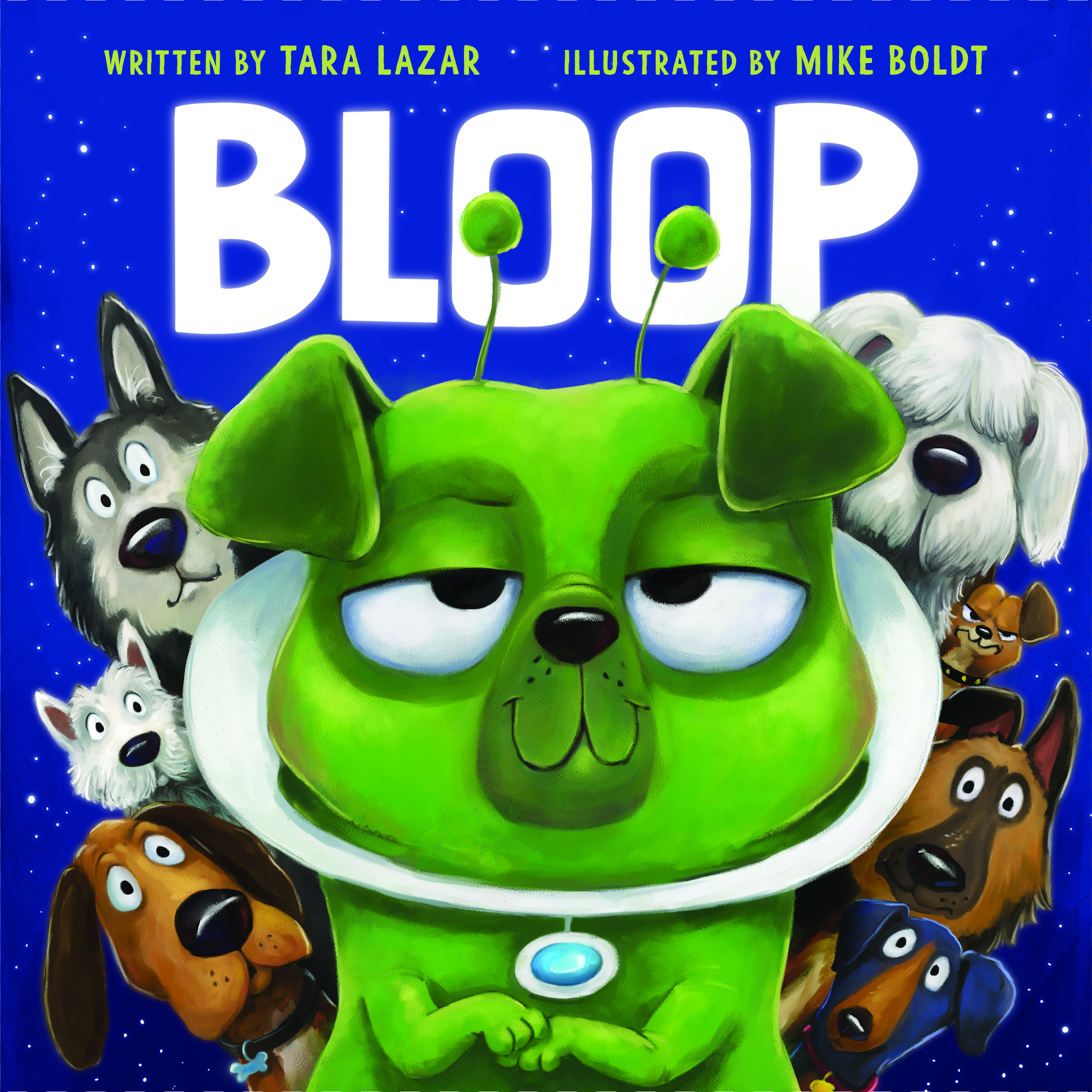
I was chatting with my editor last week about my upcoming book with Mike Boldt, ALIEN IN THE DOGHOUSE (working title). I mentioned my philosophy about picture book art notes—how they describe the action that needs to happen for the story to work.
While I teach this at writing conferences and workshops, I never Tweeted it. So…

…and this resonated with a lot of picture book writers.
New writers often hear “don’t use art notes”—but that’s not correct.
I believe some editors/agents say that because new writers tend to misuse art notes. The mistake is overusing them—writing visual instructions that are unnecessary or superfluous. It’s like writing [bunny hops away] when the text already says that the bunny skedaddled.
Misused art notes can also dictate what things should look like when that’s not a writer’s job. Art notes like [she has pigtails] or [green ball] aren’t the writer’s decision. The only time something like that is necessary is when the appearance of pigtails or a green ball act as important plot points. Can the girl have short, curly hair? Can the ball be orange? Does the story still make sense? Then leave out the art notes.
Art notes should only be used when it’s not clear what’s happening from the text alone. Like when you want to be subversive:
She smiled!
How will anyone know your character is supposed to look upset? Art notes! Erm, I mean ACTION NOTES.
Then Kevin asked me a question…

So, here’s my newest book from Tundra, YOUR FIRST DAY OF CIRCUS SCHOOL, illustrated by the fabulous Melissa Crowton.

I set out to write a story with mostly visual puns and jokes, and this book is the result.
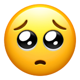
Here’s one of my favorite pages…
My manuscript reads:
Don’t worry, the bus has an endless number of seats! [clown car]
How else is the illustrator supposed to know the school bus is really a clown car?
Then there’s this page…

My manuscript reads:
Walk this way! Your big brother will show you the ropes. [tightrope]
Now, truth be told, I imagined the brothers on a high wire, carrying a balance stick and walking into the school, hence the “walk this way”. However, coupled with the previous page, which had to show the BIG TOP, this was the best way to illustrate the entire spread. Notice I did not dictate exactly how or where the tightrope should go. All the illustrator needs to understand is the literal tightrope.
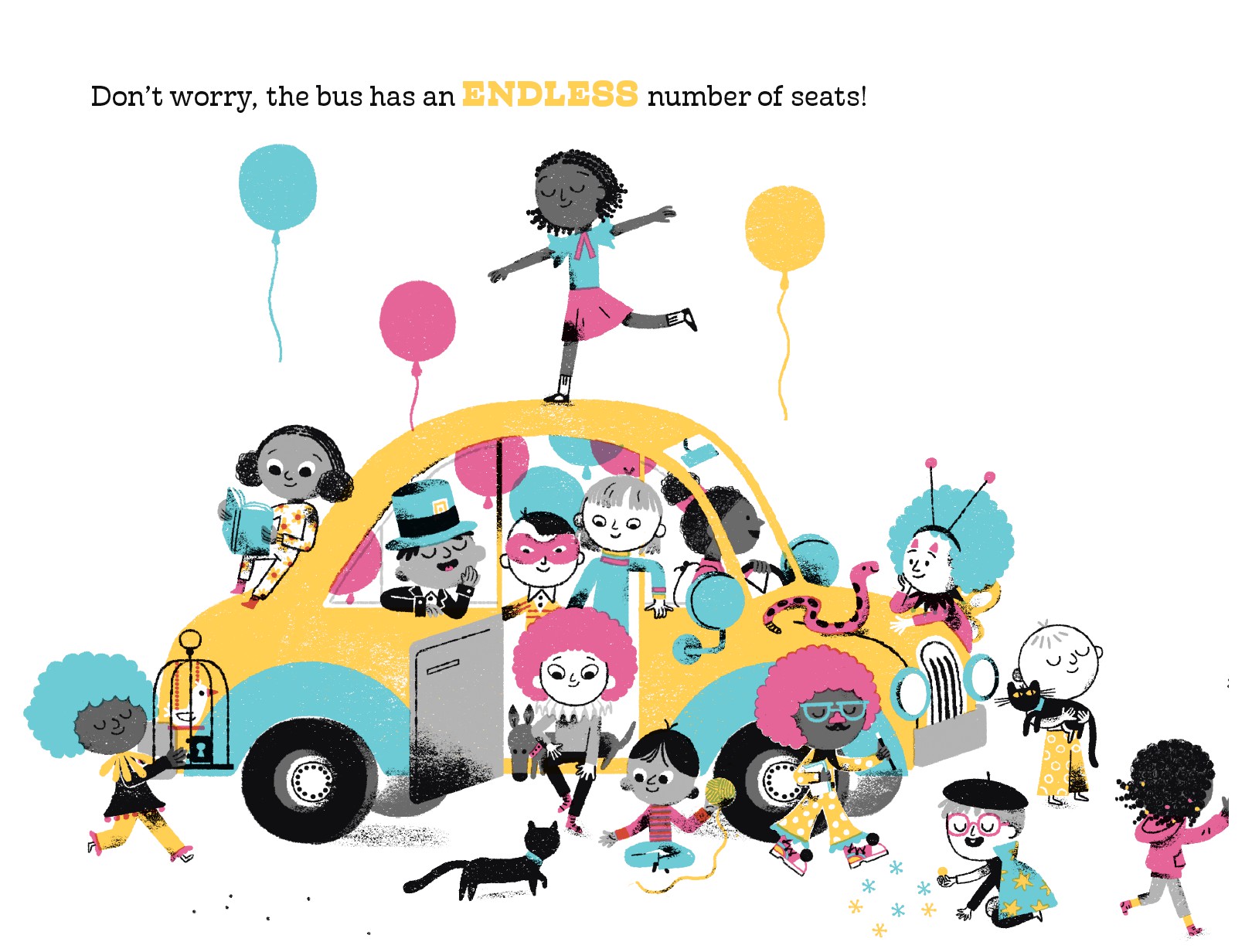
And this is another hilarious page…
My manuscript reads:
You can let off some steam during recess [circus train], but watch out for other stuff that steams! [poop]
Ahh, what’s a picture book without some well-placed scatological humor?
That’s how I approach art notes, as action notes. Note that I don’t even write “art note” between the brackets—the brackets and italics is enough for the editor and illustrator to know what they are.
I try to be as succinct as possible so I don’t interrupt the flow of the story.
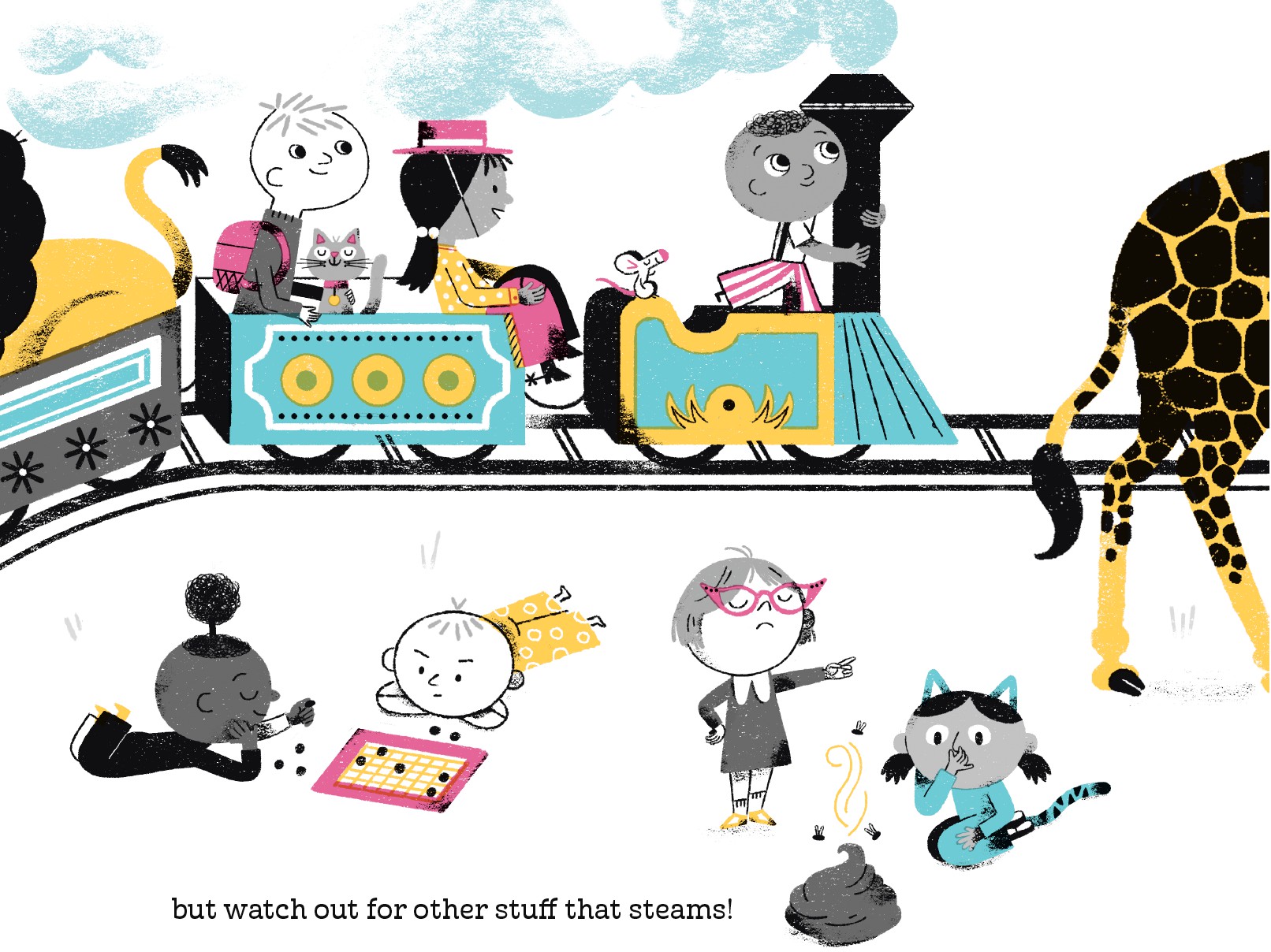
But Tara, I hear you ask, what do you do when the art notes are so plentiful, it does interfere with reading the story?
Well, take a look at the grid format solution. It’s how my agent and I submitted YOUR FIRST DAY OF CIRCUS SCHOOL!
And now that it’s back-to-school time, how about a giveaway?
I have 3 signed copies of YOUR FIRST DAY OF CIRCUS SCHOOL!
Leave one comment below to enter. A winner will be randomly selected next week!
Good luck—with your art notes and the giveaway!
A few weeks ago, I teased the cover to my upcoming book YOUR FIRST DAY OF CIRCUS SCHOOL on Twitter. You may have seen some garbled gobbledygook like this:

You can see a little hint of what’s to come in the lower right corner…
Or you can see the entire thing by following the cover evolution below…
 The illustrator is Melissa Crowton, winner of SCBWI’s 2017 Winter NYC Conference portfolio showcase. Yeah, I am one lucky ducky to be paired with Melissa’s whimsical art.
She’s the star of this cover reveal, so let’s ask her some questions.
Melissa, what was your approach to the cover design for YOUR FIRST DAY OF CIRCUS SCHOOL?
The cover for this book was such a delight to work on. Covers in general are always a challenge—a lot of questions go through my mind.
- What type of mood do I want the cover to convey?
- Should it tell a story?
- Should it be simple, or more complex?
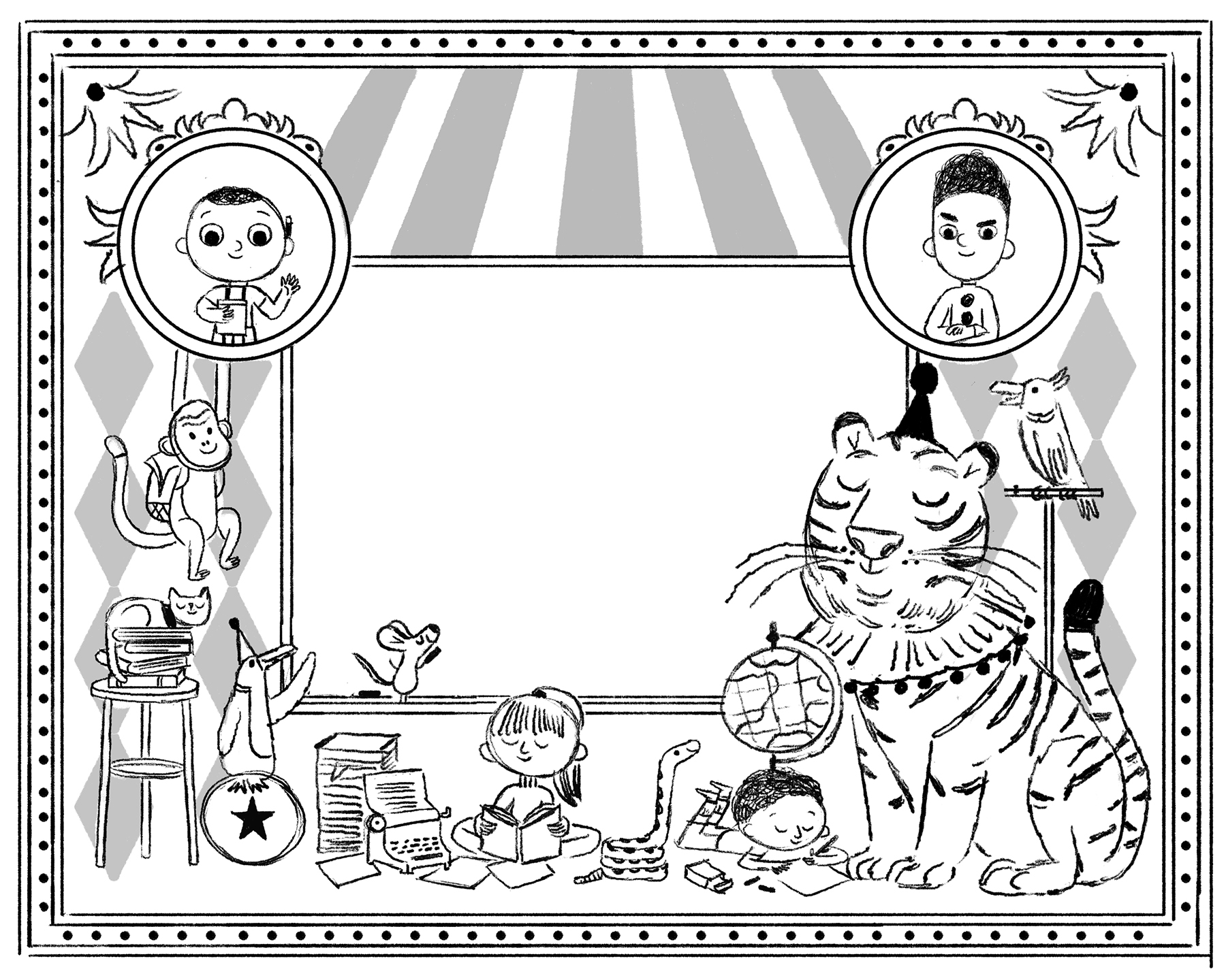
Because this book features a circus school, I knew that I wanted the cover to reference vintage circus memorabilia in some way—a nod to the past, but with a modern update.
I love collecting images for any project, and luckily for this book there was a gold mine of photos and poster designs available in books and online. The first sketches I worked on for the book were more simple in nature—a cast of characters against a backdrop of the stripes of the tent.


There are so many fun children and adults who show up in the book, and the publisher and I thought it might be fun to have a group on the cover, almost like a school photo. But the more we worked on it, the more it didn’t quite fit. So I went back to the drawing table and I decided to take a more decorative approach.

One thing I noticed in my research was a consistent use of graphic patterns and simple shapes. I had saved some images of old poster designs that used borders and shapes to highlight parts of the circus, so I thought that using a device like that show off the main characters, while also alluding to the busy school setting might be a good solution. I was also able to squeeze in a few animals friends on the cover as well which is always fun.
Once the publisher approved of my second attempt, everything was pretty easy at that point—I arranged the elements around the central focus, the blackboard, and passed my artwork off to the folks at Tundra after I was finished for them to add the title.

Although covers generally go through a lot of back and forth, I am so happy with where it ended up. I wanted the end result to hint at the exciting nature of the story inside, so hopefully it does just that!
How did you decide upon the color palette?
I looooove color, so choosing to make a book with a limited palette was a challenge, but also really fun! I didn’t realize how much I would love trying out different combinations.
I knew I wanted the interior to use a lot of black and white elements, so that was easy to nail down. As for the other colors, that was a bit more difficult, especially considering how many different animals and people were going to be in this book. I had originally chosen a yellow and blue color, but we decided to add pink into the mix to round it out—basically the primary colors but with a twist. I love that the colors play well off of each other but have their own personality, just like the characters in this book.
Did you go to the circus as a kid? What was your favorite part of the circus?
I went to the circus once as a kid with my mother and three sisters. I remember being really excited to see the performances, but my favorite part was actually the costumes. I loved that everyone looked different, but at the same time they were all part of a big family. There were a lot of patterns and colors in interesting combinations which is always something I have tried to incorporate into my own illustration work. I still love looking at old images of the circus for inspiration, there is a lot of great design that was used to promote the circus during those early years.
Melissa, you did a stupendous job on the cover! Thanks for showing us your process to get there!
YOUR FIRST DAY OF CIRCUS SCHOOL will be released by Tundra Books on June 4, 2019.
You can pre-order now…online or via your local indie…and if you do, leave a comment telling me so.
Everyone who pre-orders will be entered to win a PRIZE PACK of circus school goodies, including a signed F&G, poster, SKYPE call/visit, and whatever other good stuff I can stuff in the package.
Thank you, Melissa and Tundra Books!
Melissa Crowton is an illustrator and designer who has been recognized by the Society of Illustrators, American Illustration, Creative Quarterly, and the Society of Children’s Book Writers and Illustrators as the Portfolio Showcase winner at their Winter 2017 Conference. She earned her BFA in Illustration at BYU in 2012 and an MFA in the Illustration Practice Program at Maryland Institute College of Art in Baltimore in 2016. Melissa originally hails from Utah, but she now lives in the East Bay of Northern California. Visit her at melissacrowton.com and follow her on Instagram @mcrowton.