You are currently browsing the tag archive for the ‘art notes’ tag.
I was chatting with my editor last week about my upcoming book with Mike Boldt, ALIEN IN THE DOGHOUSE (working title). I mentioned my philosophy about picture book art notes—how they describe the action that needs to happen for the story to work.
While I teach this at writing conferences and workshops, I never Tweeted it. So…

…and this resonated with a lot of picture book writers.
New writers often hear “don’t use art notes”—but that’s not correct.
I believe some editors/agents say that because new writers tend to misuse art notes. The mistake is overusing them—writing visual instructions that are unnecessary or superfluous. It’s like writing [bunny hops away] when the text already says that the bunny skedaddled.
Misused art notes can also dictate what things should look like when that’s not a writer’s job. Art notes like [she has pigtails] or [green ball] aren’t the writer’s decision. The only time something like that is necessary is when the appearance of pigtails or a green ball act as important plot points. Can the girl have short, curly hair? Can the ball be orange? Does the story still make sense? Then leave out the art notes.
Art notes should only be used when it’s not clear what’s happening from the text alone. Like when you want to be subversive:
She smiled!
How will anyone know your character is supposed to look upset? Art notes! Erm, I mean ACTION NOTES.
Then Kevin asked me a question…

So, here’s my newest book from Tundra, YOUR FIRST DAY OF CIRCUS SCHOOL, illustrated by the fabulous Melissa Crowton.

I set out to write a story with mostly visual puns and jokes, and this book is the result.
Here’s one of my favorite pages…
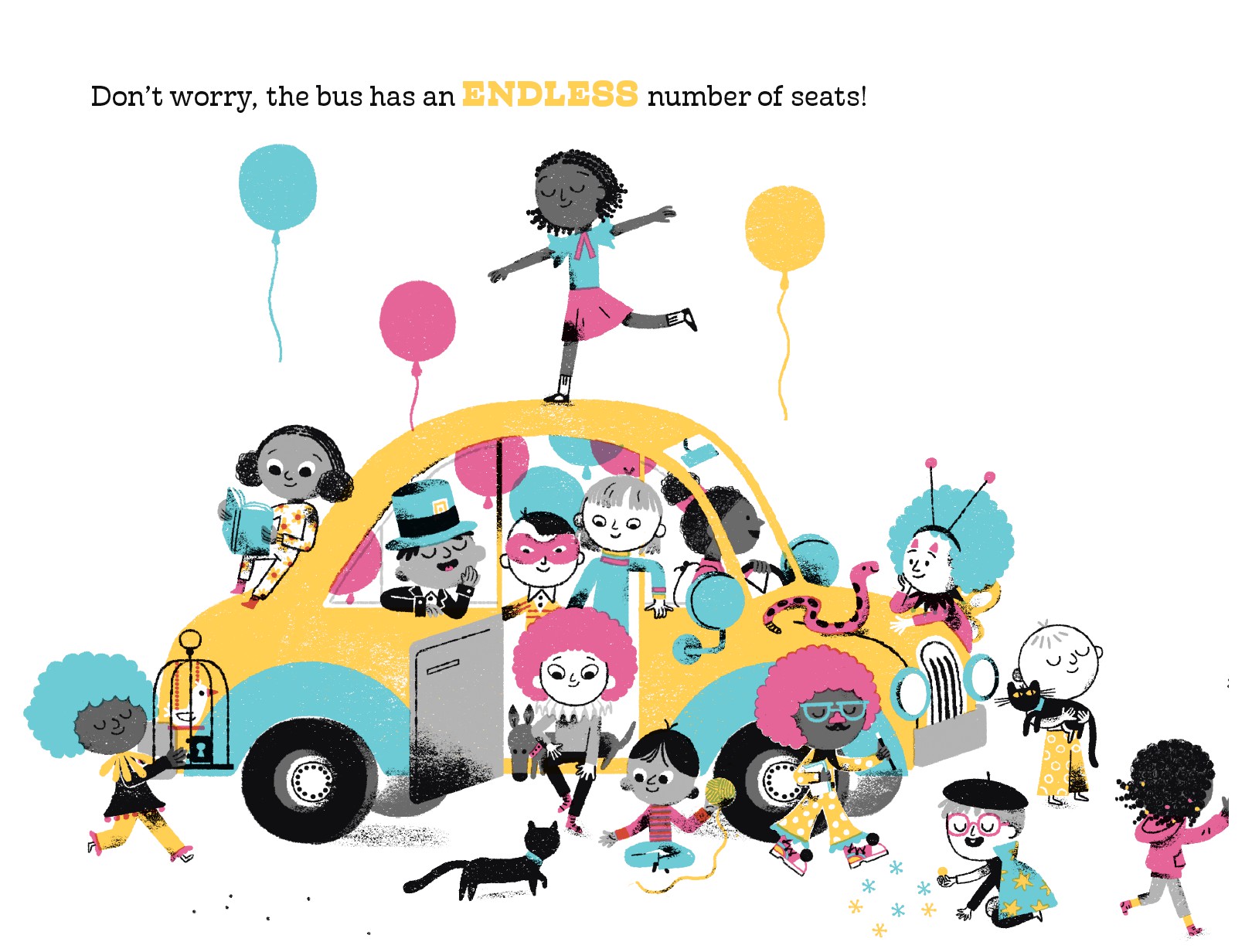
My manuscript reads:
Don’t worry, the bus has an endless number of seats! [clown car]
How else is the illustrator supposed to know the school bus is really a clown car?
Then there’s this page…

My manuscript reads:
Walk this way! Your big brother will show you the ropes. [tightrope]
Now, truth be told, I imagined the brothers on a high wire, carrying a balance stick and walking into the school, hence the “walk this way”. However, coupled with the previous page, which had to show the BIG TOP, this was the best way to illustrate the entire spread. Notice I did not dictate exactly how or where the tightrope should go. All the illustrator needs to understand is the literal tightrope.
And this is another hilarious page…
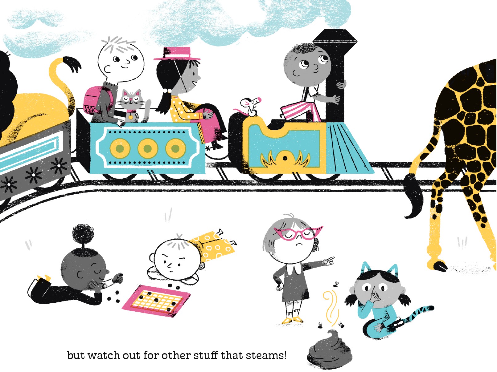
My manuscript reads:
You can let off some steam during recess [circus train], but watch out for other stuff that steams! [poop]
Ahh, what’s a picture book without some well-placed scatological humor?
That’s how I approach art notes, as action notes. Note that I don’t even write “art note” between the brackets—the brackets and italics is enough for the editor and illustrator to know what they are.
I try to be as succinct as possible so I don’t interrupt the flow of the story.
But Tara, I hear you ask, what do you do when the art notes are so plentiful, it does interfere with reading the story?
Well, take a look at the grid format solution. It’s how my agent and I submitted YOUR FIRST DAY OF CIRCUS SCHOOL!
And now that it’s back-to-school time, how about a giveaway?
I have 3 signed copies of YOUR FIRST DAY OF CIRCUS SCHOOL!
Leave one comment below to enter. A winner will be randomly selected next week!
Good luck—with your art notes and the giveaway!
“Don’t use art notes,” is what you may hear as a new writer.

It’s not that editors don’t like art notes. It’s just that many new writers want to dictate illustrations that do not require direction.
 For instance, you shouldn’t pick what your character looks like. Red hair, blue shirt, green sneakers, pigtails, etc. are not for you to decide. The editor of Mary Ann Hoberman’s THE SEVEN SILLY EATERS thought the characters should be animals, like crocodiles. Marla Frazee, the illustrator, thought they should be people, and she was right. She even made the mother a cello player, which was not in the text, but it added a delightful layer to the mother’s personality. The options were wide open—the author never described the characters’ appearance.
 The exception to this rule is when your character’s appearance is crucial to the story, like FRECKLEFACE STRAWBERRY. Although the title pretty much says it all, right?
You must trust that your editor and illustrator have ideas for what your scenes should look like. Better ideas than you. Leave the art direction to them (and the art director). Writing that the house has a front porch, or that the cat is calico, or that the car is yellow is all unnecessary. Again, unless that car needs to be yellow for your story to work.
But you will no doubt read picture books with subversive text—where the character is doing completely opposite what the words say. Or books with text so spare, the action comes thru only in illustration. These are times when your text requires art notes. SCREAMS for them.

But if you have an art-heavy manuscript, where much of the story relies upon the illustrations, how do you submit it? Putting the art notes in [brackets and italics] is typically the way to go. However, too many art notes can interrupt the flow of the story. It gets difficult to read and comprehend.
So what do you do?
Maybe…submit your manuscript in grid format.
What?! But Tara, I’ve NEVER heard of this before.
I know, me neither. But my agent just submitted a manuscript like this. I was skeptical at first, but then I realized the grid was the best no-nonsense way to present the text with the illustrative mayhem. Yes, this book has MAYHEM. And FRACAS and PANDEMONIUM, too.
Here’s what the grid looks like in manuscript format:

The header includes your name, contact details and a word count.
Then the title (in caps) and your byline.
There is a general art note at top which introduces the story idea. Moreover, it states the art notes are “intended as a guideline.” Again, as an author, you cannot rule over all that is picture in picture books.
Next comes the grid. On the left is the story text, on the right appears “rough art direction.” Notice we said “rough” because they are only suggestions for the editor to understand the story. Remember that the illustrator may create something even better, funnier, more poignant. Remember the CELLO.
The grid continues for as long as it takes to tell your story. Typically one or two more manuscript pages.
Please note this isn’t a standard way to submit, it only serves as an example of what one author and her agent did. It’s like the photos on the front of frozen food boxes that say “serving suggestion”.

Now if you’ll excuse me, I suddenly became very hungry.