You are currently browsing the category archive for the ‘Author-Illustrator’ category.
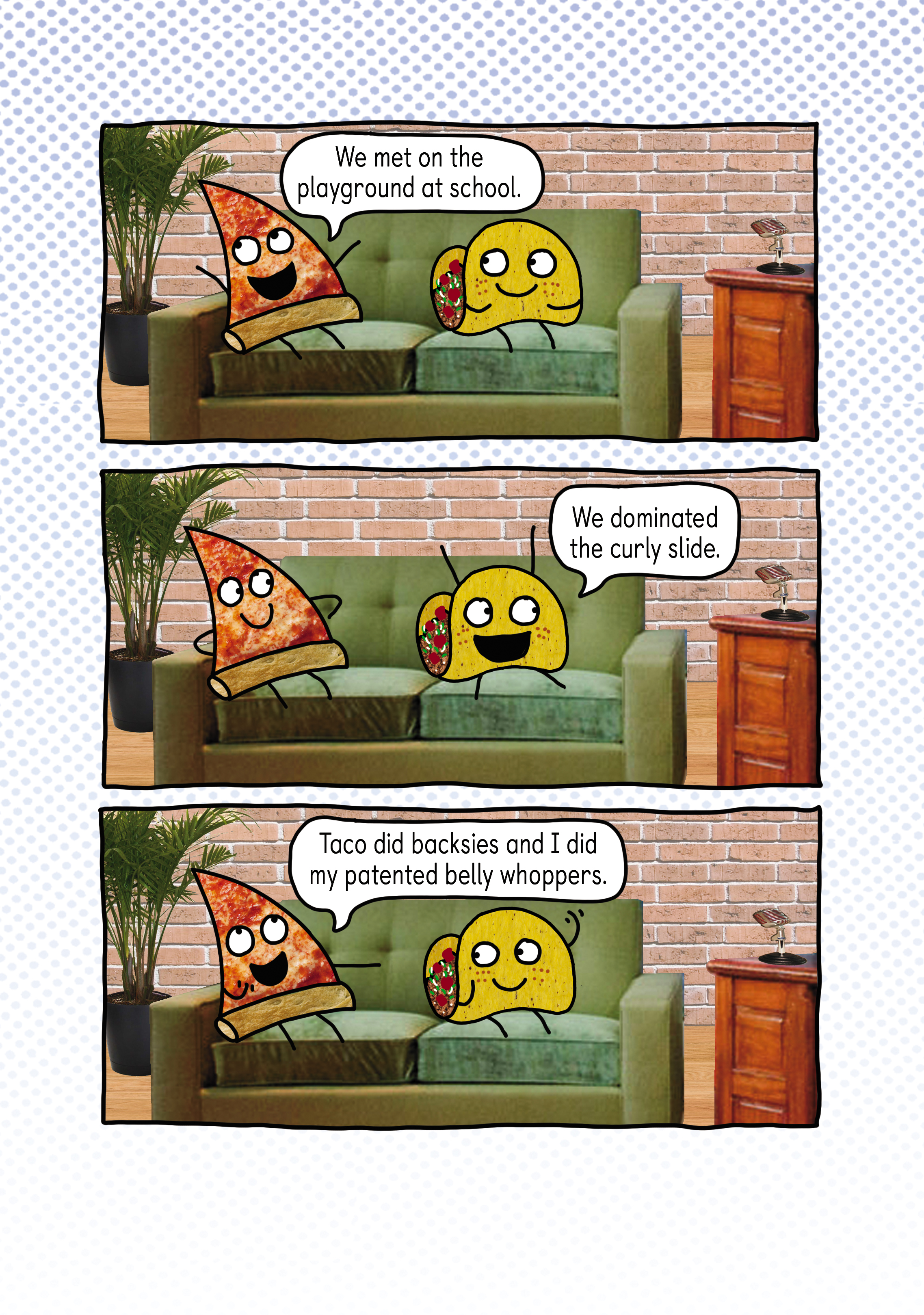
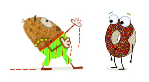
It’s the age-old question: what’s for dinner? Pizza? Or Tacos?
Tough decision! Pizza could have anything ON it, but then a taco could have anything IN it. Limitless possibilities! So who’s the best?
Luckily, author-illustrator Stephen Shaskan has settled the debate with his newly released chapter book:

This is the first in a delicious new illustrated series!
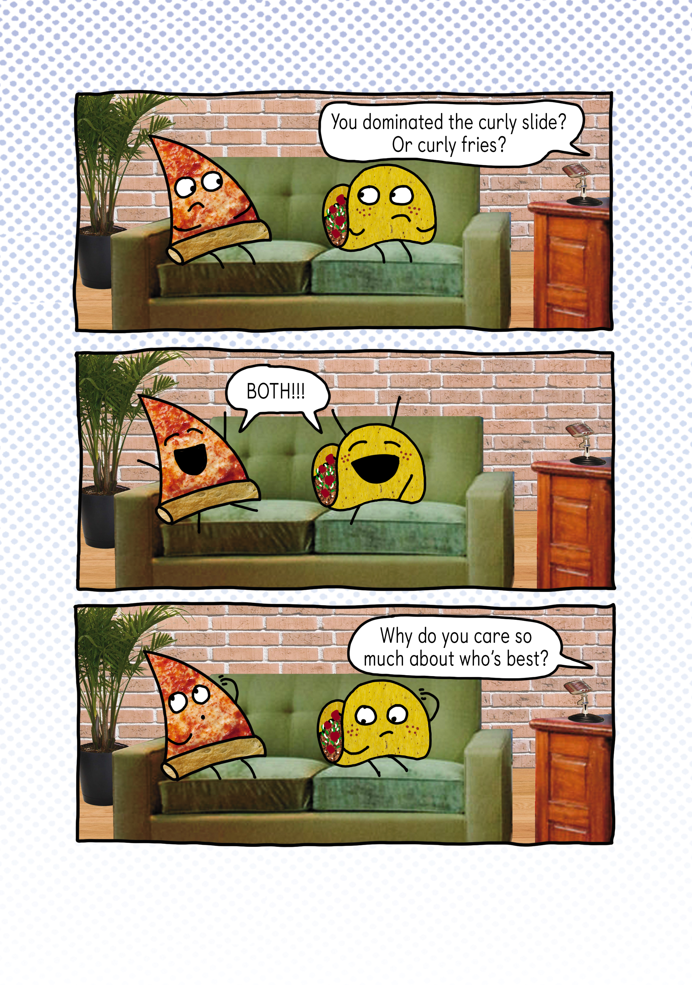
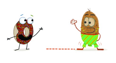
I like to interview folks about their books, and luckily, both Pizza and Taco were available to take a seat, and they didn’t even leave melted cheese on my couch! Not a chunk of cheddar or a morsel of mozzarella! What polite guests.


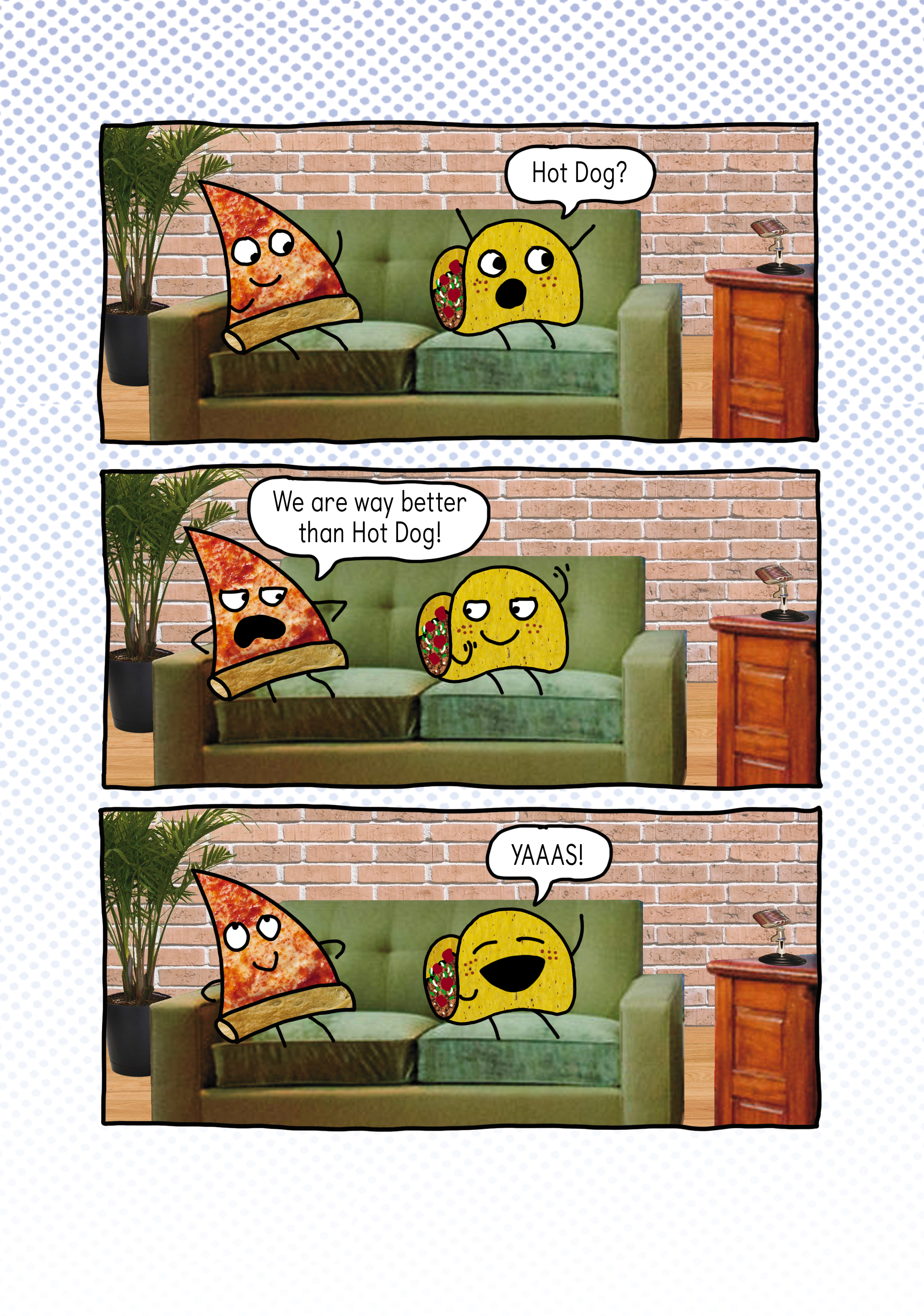


What? Don’t you like tunafish sandwiches?
Guys, come back!!! I’ve got pickles, too!
OH WELL.
Maybe you want to figure out who’s best. (Do so quickly, because you don’t want to be late for their BEST PARTY EVER in the Spring!)
Stephen is giving away a signed copy of PIZZA AND TACO: WHO’S THE BEST? to a lucky winner.
Just leave one comment below to enter.
Winner will be randomly selected in July.
(Sorry, actual pizza and taco not included. They don’t travel well.)
At the risk of dating myself, I’ll mention an old commercial tag line from the 1970’s—“when E.F. Hutton talks, people listen.”
Well, when Holiday House contacts you and asks if you’d like to chat with two-time Caldecott and Geisel Honor book winner Laura Vaccaro Seeger, you also stop everything and LISTEN!
Laura’s latest book is a charmer, snuggle-worthy for the littlest ones. It’s titled, simply, WHY?
I met Laura last year at the Irma S. Black Award ceremony where she served as keynote speaker. She showed us her newest book at the time, BLUE, about a boy and his best friend. (Notice how the die cut on each page forms a new part of the image with each turn.)
Laura, you must know you are the only PB creator to make my husband tear up, as you read BLUE. And he’s never even had a dog! He was incredibly moved. How do you inject so much heart into your stories?
With every book, I try to distill the story down to its essence and I always draw upon strong feelings and beliefs while writing and illustrating.
With BULLY, for example, I’ve always felt a deep sense of empathy for anyone who was bullied or feeling left out, so it was important to me that above all else, empathy is the most important aspect of that book.
BLUE is probably the most difficult book I’ve ever created. It really comes from a deeply personal place. As a young child, I’d experienced the sudden loss of a family member—my brother—and that very complicated trauma was never really worked through. Consequently, I’ve always had an overwhelming fear and dread of loss. BLUE is a kind of therapeutic, cathartic personal exercise, but more importantly, it’s an attempt to offer comfort, as well as a starting point for deeper discussion with young children, (or anyone, really).
Your husband’s reaction truly means a lot to me!

So with your new book WHY?, what did you distill its essence down to?
WHY is a about curiosity, patience, and understanding. The little rabbit is having a bit of an existential crisis, and at one point in the book, the apparently all-knowing bear is faced with a similar crisis as he realizes that he can’t explain everything after all. Ultimately, their loving and enduring friendship is more important than anything, even when there are unanswerable questions. (I’ve always been fascinated with unanswered questions…)
Why do you think WHY? is a child’s most pressing (and frequent) question?
Well, given that children are witnessing everything pretty much for the first time, I think it makes sense that they would seek to have a deeper understanding of what they’re seeing and hearing.
I think adults often take for granted their surroundings, even if those deeper meanings were never fully explored or questioned.
Why are the characters in the book a bear and a bunny—instead of a bear and cub (or rabbit and bunny)? Why is the relationship shown as one of friendship instead of parent-child?
Ah, I thought long and hard about that.
With this book, as with many, I had an immediate vision that I wanted to stay true to. I knew that I wanted one of the characters to be very large, and one super small, which in many ways ended up dictating the decision about whether or not they’re related to one another. I also wanted them to be friends rather than relatives because friendship is a voluntary relationship, which I felt made the story more interesting in many ways.
Also, from the beginning. I’d envisioned a bear and a rabbit, but I did explore a substitute for the bear because I was worried that there might be confusion between the bear in WHY, and the bear in my DOG AND BEAR series. In the end, I felt the bear was undeniably perfect, and I was confident that the character would be distinctive in its own right.
He is distinctive! And so lumpy in a furry-cuddly way. Plus, it’s more visually interesting to showcase contrasting characters!
Speaking of your art, it’s gorgeous, full of depth and texture. Can you tell us a little about your illustration process for WHY?
Sure! With each book, I try to envision an art style that will match the text I’ve written. Hence the multiple, various art styles over the years.
With WHY, I envisioned a softer style, unlike any of my other books. It’s been years since I’ve worked with watercolors, and I had such a great time painting the art for this book!
So, I began each painting with a pencil drawing, and then I painted over the drawings with watercolor paint. I repeated this process lightly, many times, which gave the art depth and a layered feel, without any thick paint or brushstrokes. This way, the softness was retained and the pencil lines showed through.
Once all of that was done, I still felt it needed something – a bit of grittiness and a little more depth. I wanted it to feel more organic.
So, I finally broke out a fabulous gigantic Japanese brush I’d bought a few years ago in Singapore and I soaked it full of water so that it was completely saturated. Then, I brought it into my backyard where I dipped the sopping wet brush into India ink and flung it at watercolor papers. When I was finished, I had a huge stack of paper, each sheet full of splotches, spots, drips, etc. I created so many sheets because I didn’t want to repeat any of the elements.
Then, I scanned my original watercolor paintings and all of the “splotch” art sheets. For each painting, I overlaid several different “splotch” art sheets, I isolated the splotches, and I either lightened or darkened those areas on the original paintings.


Your process is fascinating! I love the thick and chunky Japanese brush!
What’s so lovely about the illustrations is that they feel soft and safe for a young child who is asking WHY, who is questioning the world around them. What do you hope that young reader will take away from your story?
I think with WHY, I’d love to encourage curiosity and the freedom and “permission” to question absolutely everything, which ultimately I believe, would encourage independent thought and informed decision-making. I also hope WHY is an example of patience and understanding, for sure. And lastly, I hope that young readers understand that not all questions have immediate answers, and that’s okay.
What a wonderful take-off point for a meaningful discussion between adult and child.
Thank you, Laura, for giving us a glimpse into your creative process!
WHY? is available from Holiday House on August 13…or you can win a copy here.
Leave a comment below and someone will be randomly selected to receive a copy in a couple weeks.
One comment per person, please.
Good luck!
 Laura Vaccaro Seeger is a New York Times best-selling author and illustrator and a 2-time winner of the Caldecott Honor Award, winner of the New York Times Best Illustrated Book Award, the Boston Globe/Horn Book Award for Best Picture Book, and a 2-time winner of the Theodor Seuss Geisel Honor Award. She is also the recipient of both the Massachusetts Reading Association and the New York Empire State awards for “Body of Work and Contribution to Children’s Literature.”
She earned her BFA degree at the School of Fine Art and Design at the State University of New York at Purchase. She then moved to Manhattan and began a career as an animator, artist, designer, and editor in network television. She created show openings and special segments for NBC and ABC for many years and won an Emmy Award for an opening animation for an NBC Special.
Laura and her husband, Chris, have two wonderful sons, Drew and Dylan. They live in Rockville Centre, New York. She loves painting, writing, surfing, boating, tennis, running, playing the piano, and spending time with her family and friends.
Visit her at www.studiolvs.com.
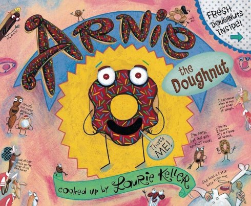
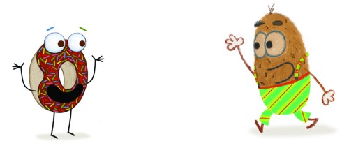
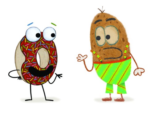
One of my favorite picture books of all time is ARNIE THE DOUGHNUT, cooked up by the inimitable Laurie Keller. (Why hasn’t it become a major motion picture? I sniff the heavenly aroma of sugary fried dough and box office smash potential!)
So while you wait for the selection of Storystorm prizes, I invited Arnie to the blog to interview Laurie’s latest character, Potato, about his quest for the perfect pair of pants. Take it away, boys!

Hey Potato! Thanks for meeting me at the bakery. Did you have any trouble finding it?
No trouble at all! I just took a Tuber Uber.
I see you have your new Potato Pants on! I was hoping you’d wear them.
Oh, yeah––I never leave home without ‘em! Pretty snazzy, aren’t they? Yep, when it comes to designing flattering pants for potatoes, Tuberto is your go-to tater!

I heard you almost didn’t get your Potato Pants––something to do with an eggplant. What was the problem?
He was waiting for me in Lance Vance’s Fancy Pants Store on the ONE day they were selling Potato Pants and I didn’t want to go in there because I was afraid he’d push me like he did the day before and ruin my brand new Potato Pants!
So, he’s a pretty pushy eggplant, huh?
Well, I thought so but it all turned out to be a silly misunderstanding. I’m a big enough spud to admit that. We’re actually friends now!
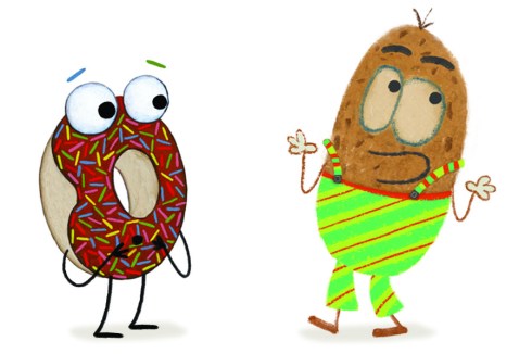
That’s cool! So, you really wanted this stripey pair with the stripey suspenders. Why do you like stripes so much?
I can’t explain it, Arnie. They just make me happy!

I feel the same way about my frosting and sprinkles!

I see you’re doing the Robot––I mean the PO-bot! Can you teach me how to do it?
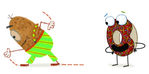
No.
But I can teach you how to do the DOUGH-bot!


Oh, no! I laughed so hard I ripped my Potato Pants!

I’ll call for help! Oh, YOO-HOO, MAKEUP!

No, I’ll just scooch right over to the Tater Trouser Tailor. Thanks for everything, Arnie!
Thanks, Potato!
What is it now, Arnie?
Oops, sorry, Makeup––problem solved. But as long as you’re here…do you mind arranging my sprinkles into stripes? Diagonally? By color? Pretty please with frosting on top? Thanks!
I LOVE ‘EM!

But I wonder if vertical stripes might be better on me?

Oh, YOO-HOO, MAKEUP!
Well, we all know that Arnie is a diva doughnut (just like Mariah Creamy).
Thanks for stepping in to interview Potato, Arnie!
Since I am such a ginormous Laurie Keller fan, I am so mashed today to offer a copy of POTATO PANTS!

Just leave a comment below to enter! A random winner will be selected after the Storystorm prizes!
Good luck!
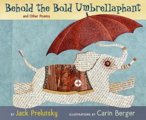
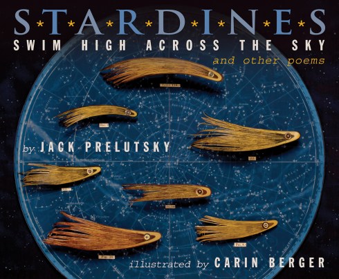
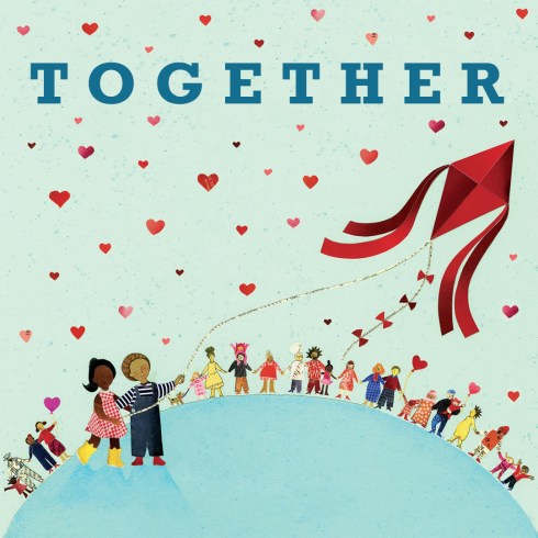
Fangirl moment. THE Carin Berger is on my blog today. A children’s book creator I have long admired, Berger’s cut-paper illustrations bring delightful whimsy to books by former U.S. Children’s Poet Laureate Jack Prelusky, as well as imbue her own stories with a joyful spirit.
When I read her newest release, ALL OF US, I thought, “This is a perfect book for today—for right now.” So of course, I had to ask her about it. Thankfully, she agreed to an interview.
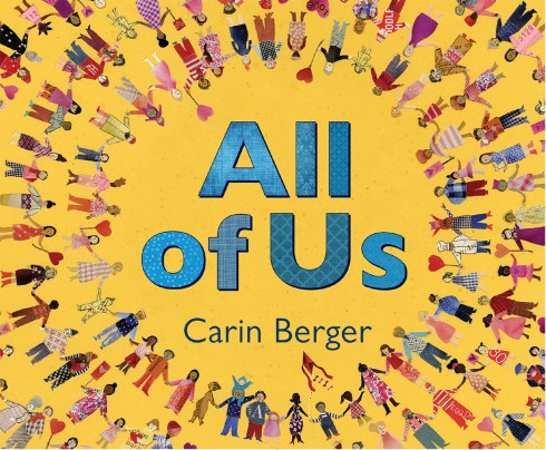
Carin, ALL OF US feels so timely, however I know it can take years to create a picture book. How did you decide upon the theme (and when)?
 While it is true that it can take years to bring a picture book into the world, I wrote ALL OF US, in a single burst, in response to the turmoil in our country, especially in the lead up to the election. In fact I wrote it while I was in Germany, the country that my family was forced to flee in the 1930s because of unrelenting racism, hatred and violence directed against vulnerable minorities. I had actually voted on Election Day and then flown to Germany that afternoon. I landed to the news of the election results. The juxtaposition of the events in our country against my own family’s history of forced displacement was upsetting and surreal. I wanted to do something to make a difference, to remind those that felt unbalanced or ostracized or alone, that community, diversity, inclusion and love are powerful and will ultimately triumph. This idea of wanting to do something dogged me for days. Or maybe it was months. In any case, there in Germany, with such a stew of feelings inside, I woke up in the middle of the night with the words to the book almost like a song or refrain in my head. I scribbled them down and made thumbnail drawings in my sketchbook. The next morning I took a picture of this on my phone and then emailed to my publisher, Greenwillow Books. And, in a terrific leap of faith, Greenwillow agreed to put this project ahead of one that was about to go to final art in order to get ALL OF US out into the world quickly.
You are known for your cut paper illustrations. Was there any special consideration of the paper you chose for this project?
I do think a lot about the paper that I use in my illustrations. I work with found ephemera in part because I love that each piece of paper comes with its own history…like secret stories…that inherently add another layer of depth to the books. I intentionally gather really diverse papers from around the world, so if you look closely at the illustrations in ALL OF US, you might see a bit of Chinese or Spanish or Japanese or Hindi or Russian.
I know you surreptitiously include your daughter’s name “Thea” in every book. Did you hide any messages in ALL OF US? Or is your message out in the open?
I love that you remember that I put “Thea” in all of my books.
It is true, in ALL OF US, there are some covert messages. Others are right out in the open.
Some examples of hidden messages are:
Thea’s name appears on the hand that is on the “know that I am here, as steady as stone” page.
Elsewhere in the book, my brother’s name, Daniel, appears in one heart.
Additionally, there are two self portraits in the book. One appears on the wordless “love wins” page holding a heart that says “thea”.
A second family portrait is on the lowest row of the left hand side of the 2nd “love wins” page. There you will find me, my husband, Max, Thea, and our pet rabbit, Pearly.

Finally, on all of the pages in the book that have illustrations of people, I have included images of family and friends within the crowds.
Also, if you look closely, you will find my daughter’s black cat, Cosette.
What’s more, there is a gentle, unspoken story going on in the book.
There are two characters that reoccur, the little girl in the yellow boots and the little boy with the red kite. The girl starts the book with a heavy heart and an unsure step. The little boy is on the page with the unclear path and his kite appears on the stormy past page.
They first appear together on the “hazy future” page, and they don’t notice each other.
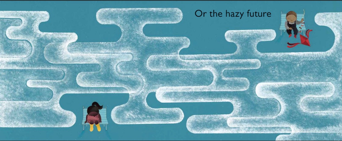
Eventually, as we make our way through the book, they notice each other and join together as friends in part of the larger community.
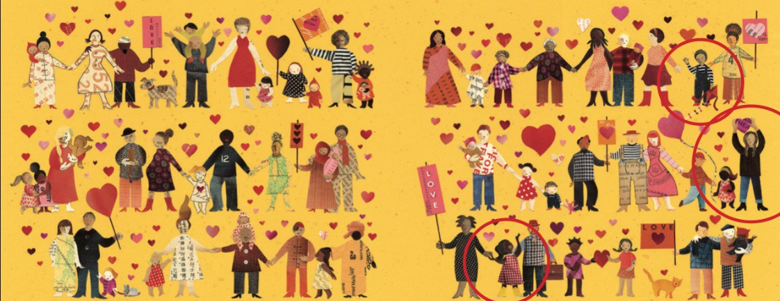
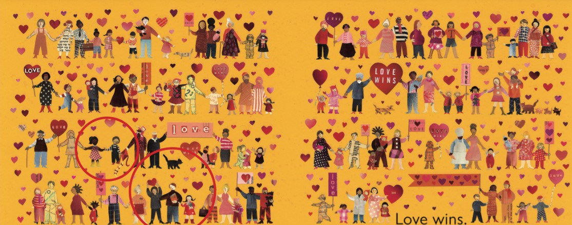
(Click to enlarge spreads.)
Carin, what do you hope readers will connect with? What do you hope they will take away after reading ALL OF US?
Hope is a great word. I HOPE that the message of HOPE in ALL OF US will resonate with readers.
I HOPE that the book makes readers feel more connected, that it opens up conversations about inclusion and community and the power of HOPE and love in the face of adversity.
Children face so many challenging moments in growing up…they are figuring out who they are, and how they fit it. They are trying to make sense of the world and navigate through all sorts of new situations. I really HOPE that ALL OF US can be a tool to bring people together and to offer empathy and light and HOPE in difficult times.
Thank you, Carin, for bringing us such a beautiful book for our uncertain times. I know I will treasure my copy.
Blog readers, if you would like your own copy to treasure, plus ALL OF US bookmarks and swag, please comment once below.
A winner will be randomly selected in September.
Good luck and thank you for reading.
 Author-illustrator Denise Fleming gave the keynote at the NJ-SCBWI conference a few years ago and she said something that has stuck with me: “My internal age is five. So I make books for five-year-olds like me.”
I had an ah-ha moment, complete with a hovering lightbulb. I’m eight, I thought. No wonder I write what I do.
Denise’s newest book was recently released, and if you’re familiar with her work, it looks a little different. I learned that Denise has changed up her style. So, of course, I wanted to chat about it.
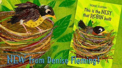
Denise, you are well known for your innovative illustrations created with paper pulp. THIS IS THE NEST THAT ROBIN BUILT looks a little different—still gorgeous and unique—but I understand you decided to reinvent your style with this book. Why did you feel the need to change up your technique?
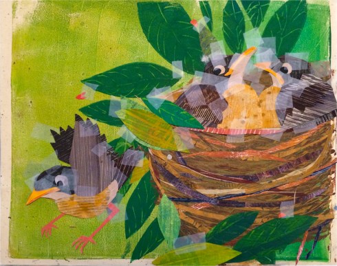
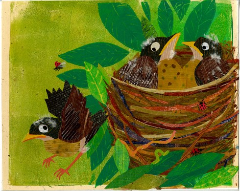
I have been illustrating my books with pulp painting for over 25 years. While I love paper making, I felt it was time for a change for several reasons. The small company where I bought my pulp had changed hands and the new pulp was causing me problems. The board I used for stencils was no longer available. I had tried substitutes but none worked as well for detail and some were difficult to cut. Then, there were the hours of standing bent over the paper vat which was affecting my health. These were all a part of my decision to experiment with new techniques.
Gelatin printing and foam printing along with collage were the techniques that really interested me. These provided more freedom and the ability to create more detail, which is difficult with paper making. I also felt I needed a bit of reinvention. I have been around for a long time, I wanted readers to take a second look at my art. I am fascinated with printmaking. Before I created books I studied printmaking, mostly etching, lithos and mono-prints. I am excited to try new styles and techniques in upcoming books.

How does this new style contribute to and enhance this story?
With the new style I am able to create more detail in the illustrations. Printing the background and collaging the foreground gives the feeling of more depth. I also am able to make papers with the textures of feathers and grasses which enhances the art and adds a feel of realism.


Has your new style given rise to ideas for books you would have never thought of before?
Actually, I will be experimenting with several new styles in upcoming books. And yes, these new styles will allow me to more ably illustrate several manuscripts I had put in the back of my file due to the fact that I couldn’t figure out how to illustrate them in my pulp painting technique. People are difficult to do in pulp painting. Up until this point I have illustrated people as large graphic shapes. Hands and fingers were stressful as the pulp would fill in spaces between figures. Ugh. So maybe more figures and details in upcoming books. And maybe even white space.
Can you tell us about any upcoming projects?
As to future books, I have been on a sort of sabbatical. Working out how I want books to look. Manuscripts have not been submitted, so I would rather not reveal any of the books until they are under contract. But, I will let you know about them as soon as I send them out and am offered contracts. I agent myself, so I have to give myself a push. Unfortunately, I love experimenting, so I am slow to get back to the business of books.
If I were to edit your reply, I would delete “unfortunately”. Readers are lucky that you keep innovating and creating even more beautiful art!
THIS IS THE NEST THAT ROBIN BUILT is available now from Beach Lane Books.
You can win a copy here by leaving a comment below. A winner will be randomly selected in a couple weeks.
Good luck!
 by Josh Nash
When you are trying to make it in a business that favors good ideas, you are going to need to get some. Easier said than done, right? It’s not the 1960s anymore when you could just send away for them by mail order catalog. (Not a lot of people know that “Where the Wild Things Are” cost Maurice Sendak $8.95 and a self addressed stamped envelope.)
So where do ideas come from? Good question. I always think of the Bright Eyes lyric by Conor Oberst about being a musician and songwriter: “I’m drinking, breathing, writing, singing. Everyday I’m on the clock.”
First, when it comes to drinking and working, I recommend coffee. But you can drink whatever you want. Tea, Black Cherry Kool-aid, Orange Julius. Second, it’s the “Everyday I’m on the clock” bit that makes the most sense to me because I like the idea of never being off the clock as an artist and a writer. It is a job we never really punch out of, isn’t it? Living a creative life is a full-time job and being open to ideas means you are always on the clock.
You are on the clock during your morning commute. Four lanes of Hondas and Subarus jockeying for the exit lane may not be the ideal setting for turning illustration or story ideas over in your head, but the creative mind never clocks out. Just be careful not to drive off the highway into a ditch especially when your last phone transmission is a text to yourself that reads “bunny has a potluck but everyone brings cups.”
Keep a notebook handy at the office because even when you are on the clock, YOU ARE ON THE CLOCK! Ideas don’t quit just because you have 150 emails to answer and Dale from Accounting is waxing interminable about his adventures in home brewing. However, you don’t want to be so focused on story ideas at your day job that you end up getting fired for being a bad employee. But if you do get fired, it would be good if you had plenty of amazing story ideas to sell. So it’s a tricky balance.

Standing in line at Starbucks? You got time to lean, you got time to clean, buddy! Ideas are working overtime at coffee shops. The right mix of caffeine and anonymous strangers milling about keep the idea synapses firing. Who is that old lady? What is her story? Who is that toddler? Why is she screaming? Why is that screaming toddler’s dad just staring at his phone while his toddler is screaming? Is he actually a cyborg dad suffering a program glitch? And there’s your idea. Write it down.
And just when you think it’s quitting time, remember that ideas work the night shift too. After you have kissed your honey or let your cat bite you goodnight, and after you have drifted into that state of half-awake, half-driving-your-bed-through-four-lanes-of-Hondas-and-Subarus because-you-are-three-hours-late-for-that-college-humanities-class-you-forgot-to-drop-in-1997, you will have one more idea. This will be a very bad idea. Do not write it down, it’s gibberish!
Ideas never take a day off. They are workaholics. All you have to do to get them is to show up, is punch your timecard and get to work. By constantly being on the clock, and making room for creative work in your daily life, whether it is writing, painting, daydreaming or doodling, ideas will come knocking at your office door, submitting their tiny résumés. And you are always considering candidates because you are always open for business. You’re always on the clock.

Josh is 50% eraser shavings, 50% animal cookies and 50% Café Americano. Josh is also horrible at math but he loves to draw. When he was very small, his mother read him books with words and pictures by Maurice Sendak, Garth Williams, Richard Scarry and Ezra Jack Keats. His dad provided him with piles of scrap paper, pens and pencils to make his own pictures. Josh is bigger now but he remembers those stories and pictures vividly. And he still loves to draw.
Josh has been drawing professionally since 2004 and has done so for the nice folks at Scholastic, Hooked on Phonics, and singer-songwriter Kenny Loggins.
When he isn’t drawing he can be found enjoying beautiful Northern California with his wife, traveling to a rainy European city, reading a book or doing any number of activities that don’t require math.
Visit him online at JoshuaNashIllustrates.com and on Twitter @joshuanashillus and Instagram @joshuanashillus.

Josh is giving away a signed copy of this adorable fox print.

by Joshua Nash
Leave ONE COMMENT on this blog post to enter. You are eligible to win if you are a registered Storystorm participant and you have commented once below. Prizes will be given away at the conclusion of the event.
Good luck!

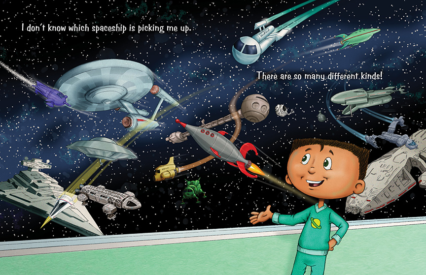
In my new book I’M GOING TO OUTER SPACE! I tell the story of a boy named Luis who tells us all about the exciting things he wants to do and see when he gets to outer space. I was inspired to write this book as an homage to all of the science fiction I’ve loved since I was young. I remember watching old B&W films like “This Island Earth” and “Invaders From Mars” on television and cartoons like “The Jetsons”. As I got older I would read books by Isaac Asimov, Ray Bradbury and Robert Heinlein and watch “Lost In Space” and “Star Trek”. I was already an avid sci-fi fan when “Star Wars” came out and my love for Science Fiction only grew further and continues to this day.
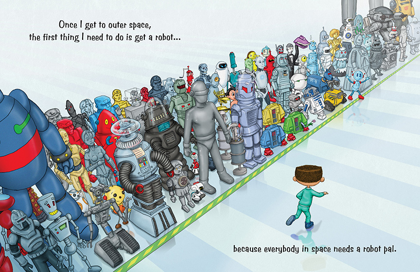
When I started to flesh out the illustrations for my story I decided to pay homage to the entire genre. I have a spread with spaceships from the 1930’s to now. I have a page of robots that I challenge any sci-fi fan to name them all. They are from movies, television, comics and even other picture books.
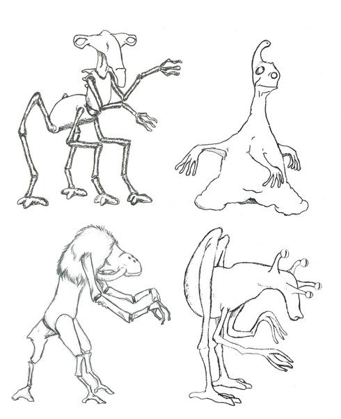
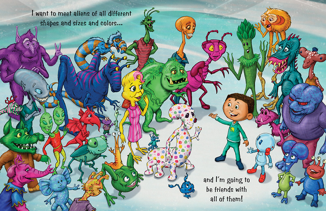
When it came time to draw aliens, I realized I had a problem. I love designing aliens, it’s one of my favorite things to draw. But I also wanted to have some classic aliens as I had done with the spaceships and robots. I decided to have one spread with recognizable aliens that kids and parents will have fun figuring out who they all are. For the rest of the book I put my own original creations designed just for this book…all except one.
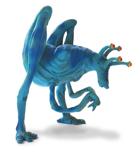
Back when I was just out of college I was hired by a friend who was an art director at Doubleday Books. They needed an illustration of an alien artist. At the time I was creating sculptural illustrations, 3D models that were photographed for print.
I created a number of sketches for the alien and when one was picked I sketched the final scene. I then sculpted the character and built his props; the easel, canvas and box of paints he uses. Another artist built the landscape and a sky backdrop was rented.
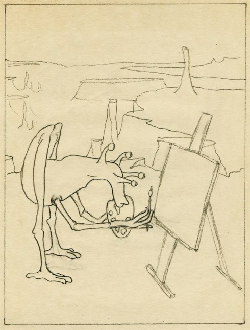
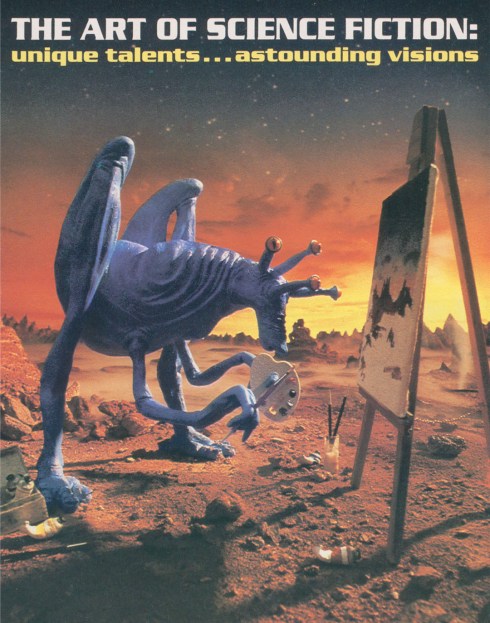
Everything was brought together at a photographers studio in lower Manhattan and the photograph was then used as the cover of a catalog of Science Fiction Art Books.
So when I started drawing aliens for I’M GOING TO OUTER SPACE! I decided to include my first alien from one of my first professional illustration jobs. He appears a few times in the book including this spread with a bunch of his friends.
I’M GOING TO OUTER SPACE! released just a few days ago…on December 15, 2017 from Schiffer Publishing.
Thanks, Tim! This was like time-traveling through outer space!
You can go to outer space, too, because Tim is giving away a signed copy of I’M GOING TO OUTER SPACE…THIS WEEK.
Leave one comment below to enter! And good luck!
I met the talented author-illustrator Roxie Munro several years ago while appearing at the Princeton Children’s Book Festival. Our tables were next to each other, and knowing she had been well-published for over thirty years, I sidled up to ask her about the business. She was gracious with the advice—when she wasn’t busy signing books! Her table was a popular destination, and I made sure to pick up a couple of her books for my daughters as well.
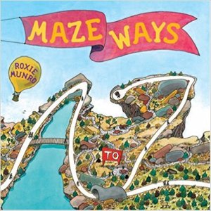 One of those titles, MAZEWAYS: A to Z, became a steady favorite in our house. Imagine “Where’s Waldo” meets a maze activity book crossed with an alphabet book. What a concept! The intricate illustrations and planning that had to go into the book mesmerized my imagination. How did she do it???
So when I saw Roxie again this spring for the Chesapeake Children’s Book Festival, I zoomed toward her table. And I spotted it—her next great concept—MASTERPIECE MIX.
Once again, Roxie was gracious enough to answer my questions about this new book—her 45th—which hits shelves TODAY from Holiday House!
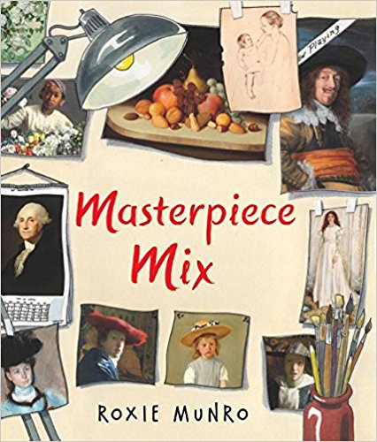
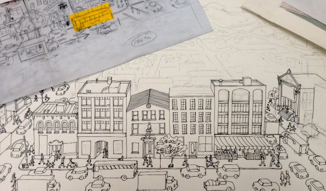
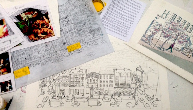
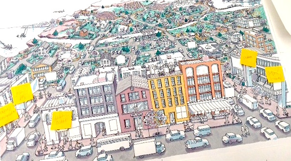
Roxie, your maze books astound me because such meticulous planning must go into every spread. Likewise, MASTERPIECE MIX must have required much planning to fit 37 art masterpieces into the final spread. Can you give us a glimpse into the process for this book?
The maze books are harder, actually (I remember once a solution to a complex maze came while I was asleep, dreaming about it). I had the idea for MASTERPIECE MIX more than 15 years ago. I did a complete dummy, but it was rejected by my publisher at the time, and I just put it into my flat files. A couple years ago, I showed the dummy to Mary Cash at Holiday House. She really liked it, but thought the middle section, where I showed perspective, color wheels, volume and shadows, and other art techniques, was too confusing. Grace Maccarone, another editor there, suggested genres, like still life, landscapes, portraits and so forth… that was the creative “click” it needed.
We were concerned about getting permissions to use images, but I discovered that the National Gallery of Art in Washington DC had just instituted an Open Access policy, so I used those images for the art in the book. The grand finale actually came easy—I just had fun figuring how to incorporate those mostly historic images into a contemporary city. Fragonard’s “Girl Reading” is a banner above the town library, Bellow’s boxers are used in a gym’s sign, Cassatt’s mother and child advertise a day care center.
[Click any image to get a closer view.]


Did any of the masterpieces in the book inspire you to become an artist?
I remember the Winslow Homer painting, “Breezing Up,” shown in the book, from my childhood—we had a print of it on our dining room wall in our home, and it fascinated me. Van Gogh became my favorite painter as I saw more of his work…I love his fresh, sensuous brushstrokes, his use of “participatory” (somewhat distorted) space, and wonderful awareness of pattern. And I adore Daumier’s dynamic lines and Hopper’s melancholy city.

Is the main character in the book really you?
Yep.
Ha, I knew it!


 My family loved art (my sister Ann Munro Wood is a professional artist also), and encouraged us to draw and paint. My parents made a special family trip to Washington DC just to see “Young Girl Reading” by Fragonard when it was acquired by the National Gallery of Art in the early 1960s—it felt like seeing the Mona Lisa—excited press reports announcing the purchase, and lots of visitors to the Gallery.
I visited Arles, France, in a pilgrimage to my beloved Van Gogh. Of course have visited the Louvre, D’Orsay etc in Paris; the Rembrandt and Van Gogh museums in Amsterdam; the Uffizzi in Florence; the National Gallery in London; Philadelphia Museum of Art; Prado in Madrid; Munch Gallery in Oslo; MOMA, the Met, and the Hopper shows at the Whitney here in NYC. And many other museums in the USA and the world, although not all in research for this book. Even visited Gauguin’s grave in the Marquesas Islands.
 I’ve also been to the Honolulu Museum of Art, San Francisco Art Institute, Chicago Gallery of Art, Kimball Art Museum in Fort Worth; Baltimore Museum of Art; National Portrait Gallery and Phillips Collection in Washington DC; Victoria and Albert in London; National Museum in Stockholm; National Gallery in Edinburgh; the Frick and Guggenheim in NYC; etc., etc.
What do you hope readers (and search-and-finders) will take away from MASTERPIECE MIX?
I hope that readers will understand that creativity requires education, and references to those who have gone before you, but also your own personal experience and insight. You need both. Creativity is often combining the old and the new in fresh ways.
And practicing—a knowledge of craft and process—is helpful. It is useful in getting your point across in an accessible clear competent way. Paraphrasing the cliche: Art is 1% inspiration and 99% perspiration.
But the creative inspiration lifts the work, and gives it wings…it delights.
Wow, thank you, Roxie. This was a fascinating look into your artwork and process.
Blog readers, you can be sure that this book delights—and you can find out for yourself by going out to get MASTERPIECE MIX, and/or winning this giveaway.
Leave one comment below to enter. A winner will be randomly selected in about two weeks.
Good luck…and keep creating!
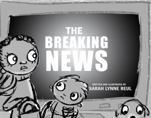
In the midst of her first Storystorm in 2015, Sarah Lynne Reul was picking up her daughter from French lessons (her husband is French with family in France) when she began receiving a slew of text messages from friends checking in to say they were safe. She had no idea what was going on. Turning on the radio, she heard scant details about the terrorist attacks in Paris.
“I walked into the after-school building full of people with family in France, and it seemed nobody else was yet aware of the attacks. I couldn’t decide if it was helpful or harmful for me to tell them about it, since I had so little information on what had happened.”
She recalled how everyone was glued to the TV during September 11, even though the news anchors kept repeating themselves, trying to reach conclusions before the mesmerized, worried audience.
While she was driving home, Sarah could tell that her daughter knew something was going on, even though the radio was off. “She told me she’d make a forcefield to protect everyone we knew, and it made my heart ache. I jotted that down when we got home as the idea of the day. I kept coming back to the concept, and a few weeks later created the first draft.”
The result is THE BREAKING NEWS, her debut picture book as author-illustrator. And today Sarah is revealing the cover with the story behind its evolution.

Thanks for hosting my cover reveal, Tara.
We went through a bunch of different iterations for the cover—my editor, Claire Dorsett, and my art director, Anne Diebel, provided lots of guidance and feedback throughout the process.
I began the process for the cover after I had finished all of the interior art. The original working title had been “THE BAD NEWS”, which felt a bit too negative, and for a while, we were playing with the title “ONE SMALL THING”, so you’ll see those names in some of the early sketches below. We eventually settled on “THE BREAKING NEWS” as a final title, which we all felt works best for the book.
Here are some of my earliest sketches for the cover.
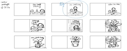
I liked the one that I had circled here—I felt like it showed a problem for the main character to solve, but ultimately it didn’t show a connection to the actual news media, which plays a pretty big role in the book.
So I tried a few options that put the focus on newspapers and/or TV, as well as the reaction of the family.
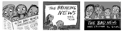
We ended up going with a variation of the middle option, and then we went back and forth on the framing. Here’s a sample mockup from Anne:
Finally, I worked on softening the expressions and exploring options for the colors and the hand lettered title to find the right combination for the final.

Fascinating glimpse into the process for this book, Sarah, thank you! And having been lucky enough to read it, I can say that it sums up the story beautifully.
THE BREAKING NEWS by Sarah Lynne Reul makes it debut April 10, 2018 from Roaring Brook Press. Mark your calendars, eager readers!

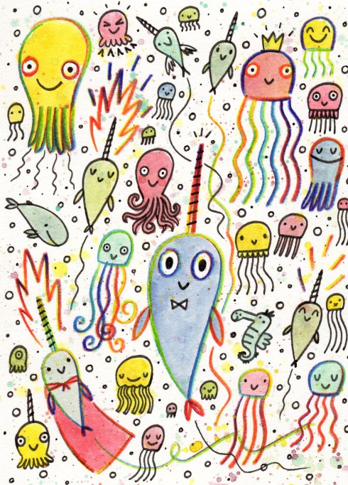
Narwhals are fascinatingly cool, and lucky us, there’s a whole buncha new books that feature these unicorns of the sea. One such hilarious take is Ben Clanton’s new _____ book series NARWHAL AND JELLY. I asked Ben to share the backstory of his most awesome underwater adventure…
Ahoy Tara,
I’m thrilled you like NARWHAL AND JELLY! Thank you!
NARWHAL: UNICORN OF THE SEA! started out as a PB, or actually a series of picture books. There have been a number of iterations, but ever since NARWHAL first swam into my brain I knew one book wouldn’t be enough for me.

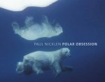 I first got it into my head that I wanted to make a book featuring a narwhal after seeing the book POLAR OBSESSION by Paul Nicklen several years ago. The book has some absolutely stunning photographs of narwhals in it and my mind was o-fish-ally blown. I must confess before seeing Nicklen’s book I didn’t really know about narwhals. That such a creature which seems so fantastic actually exists caught my imagination. I started doodling little narwhals even more than monsters, dragons, robots, or my other usual favorite subjects.

However, my first attempts at writing a story about one of these little narwhals didn’t turn out so great. Most of my initial ideas centered around a narwhal getting lost at sea and separated from its pod. I finally realized I was trying to force too serious of a story on this narwhal when standing in line for ice cream (Molly Moon’s in Seattle). Something about the smell of newly made waffle cones in the air and thinking about how they look like horns (or perhaps a narwhal tooth?) flipped a switch in my head and it suddenly clicked for me that Narwhal is the sort of character that is as sweet and awesome as waffles and ice cream AND that Narwhal’s story should be too.

Jelly, who is a bit of a worrier and skeptic, wasn’t so sure about this new approach for a narwhal story, but that night I came up with three stories (“Narwhal,” “Narwhal’s BEST WEEKEND EVER,” and “Narwhal’s Pod of Awesomeness”) and made quick storyboards and even a mock-up. By the next day I had several more book ideas featuring Narwhal and Jelly. And then a flood of new story ideas by the day after that.
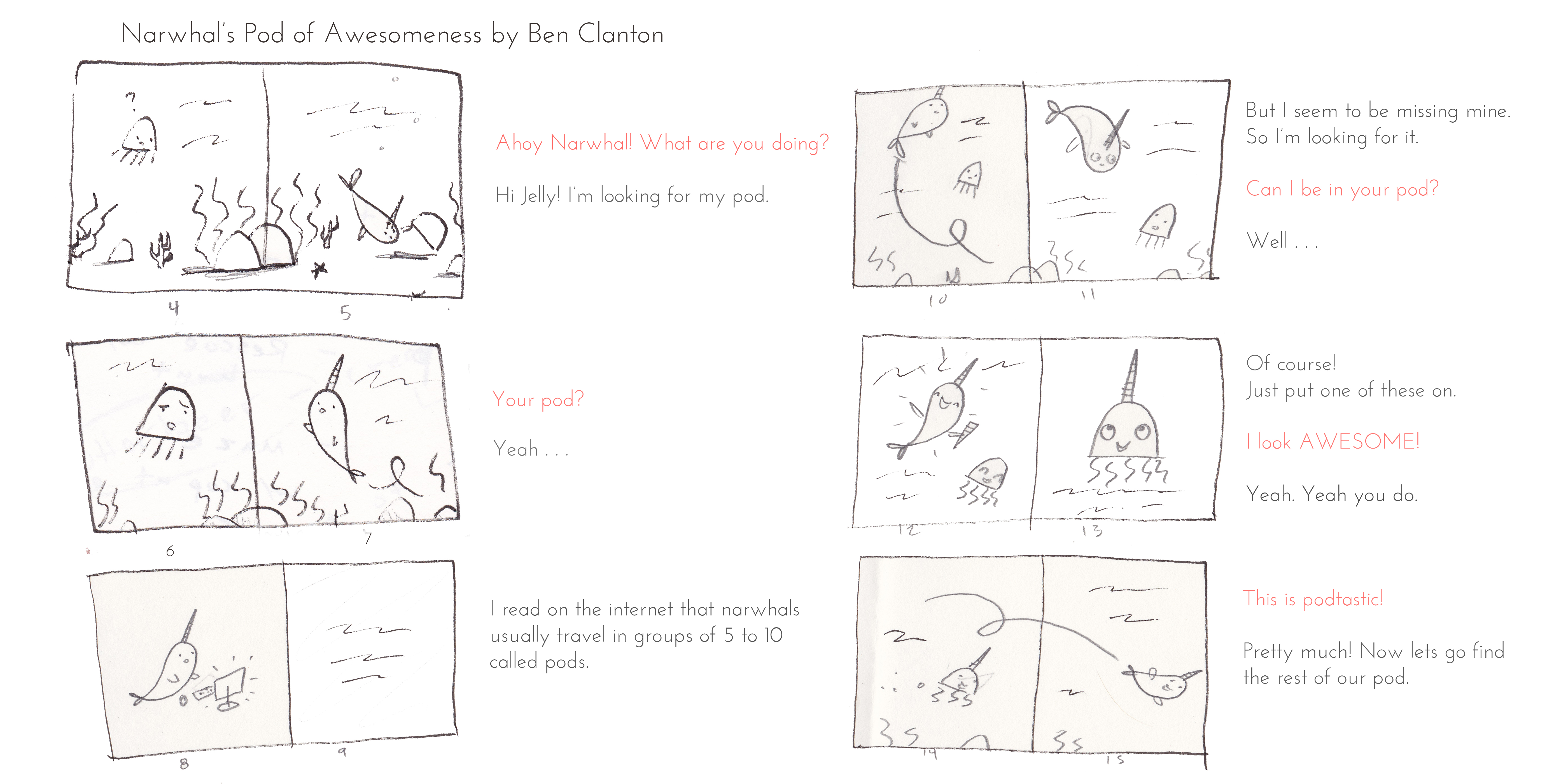
At the time, I just assumed that these stories would/should be picture books. That was the format I was most familiar and comfortable with, but after submitting to several publishers the feedback I received from pretty much everyone was more or less the same . . . the characters are great but the stories seem slight. It was Tara Walker (Tundra Books) that mentioned the stories when viewed together seemed to add up to more than the individual parts. She encouraged me to consider exploring the format and page count. I resisted this idea at first. I didn’t mind the books being light on plot. Actually, that was a part of the appeal to me and one of the reasons I felt they worked well. But as is usual for me with any suggestion Tara gives me that I don’t agree with (which is rare) . . . I eventually came to see she was right. So I tried combining a couple of the stories into a long picture book. It felt forced. It wasn’t until I started to add panels and bonus materials that i found a way to make three 32 page “picture books” into a 64 page ______ book.

This process took years in which I kept revisiting the format and what I ended up with . . . it doesn’t exactly neatly fit into the typical designations of “picture book” or “chapter book” or “early reader” or even “graphic novel.” I suppose “graphic novel for early readers” is the closest. Yet it is really a bit of a hybrid.
Somewhat ironically, even though Tara and Tundra Books had encouraged me to explore the format they weren’t entirely sure about the unusual one I had come up with, but I had been fully converted. I was sure this was the way to go. It took awhile but Tara and Tundra finally decided to take a chance on it.
And aren’t we lucky that they did!
Thanks, Ben and Tundra!
Tundra is giving away a copy of the first NARWHAL AND JELLY book, so leave ONE COMMENT below to enter. A winner will be randomly selected soon!